 Winner, 2025 European Product Design Award
Uni-Pal
Stay nourished, stay connected. A mobile app helping college students build healthy eating habits around real budget, time, and social constraints.
Winner, 2025 European Product Design Award
Stay nourished, stay connected. A mobile app helping college students build healthy eating habits around real budget, time, and social constraints.
Uni-Pal is a mobile app that helps college students eat better without blowing their budget or their schedule. We used human factors research to understand how students actually make food decisions, and where those decisions go wrong.
As project manager, I coordinated task distribution across the team (professional cat herding, basically) and contributed to user research and user-centered design, translating insights into intuitive workflows that reduce cognitive load and support sustainable habit formation.
We started with a secondary research pass on college nutrition, financial constraints, time pressure, and dining access, enough to define the problem space and set early assumptions about where Uni-Pal could actually fit into a student's day without adding friction.
From there, primary research: surveys, day-in-the-life studies, town watching, and semi-structured interviews. The goal was capturing how students really make food decisions inside class schedules, social settings, and limited budgets, not how they'd answer in the abstract. That fieldwork surfaced the recurring pain points and habitual behaviors that shaped everything downstream: feature priorities, interaction decisions, app structure.
We synthesized the research with an affinity diagram, grouping observations and pain points (so many sticky notes!) until patterns in user needs and decision-making emerged. Those patterns became five design goals, each framed as a "How Might We" prompt to keep the team focused on usability and real student context rather than feature wish-lists.
Personas, a user journey map, and scenarios grounded rapid ideation in real behavior instead of assumptions. That process generated a wide range of feature ideas, which we then narrowed into a focused concept set, distinct enough from other eating-habit apps, and stress-tested early so we could catch weak points before they reached wireframes.
With key features locked, we built a wireframe and sitemap around usability and intuitive navigation. Using a human factors lens, we mapped account creation, sign-in, and restaurant/recipe exploration to match students' actual mental models, catching navigation bottlenecks early rather than discovering them in testing.
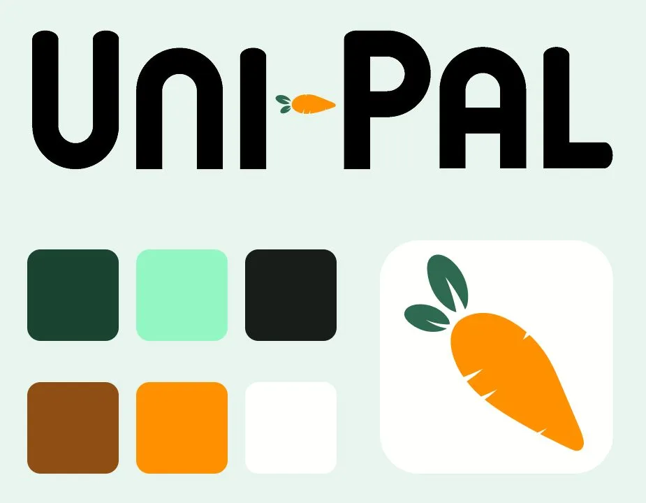
We developed a full design system for Uni-Pal, defining the colors, typography, logo usage, and iconography every screen draws from. Think of it as the recipe card every screen cooks from. Building it up front meant each screen was designed as part of one product instead of a set of separate mockups, and it's a big reason the final app reads as professional and intentional rather than assembled.
We put the working prototype in front of representative users and watched for mismatches between what they expected and what the app actually did, along with workflow inefficiencies and missed opportunities to support habit-building. Those findings drove the final round of refinements, closing the gap between the design and how students actually behave.
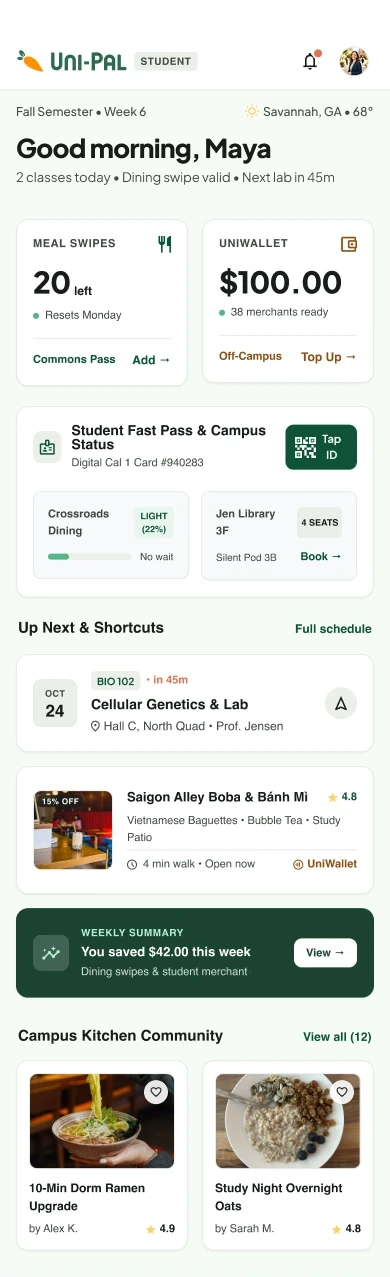
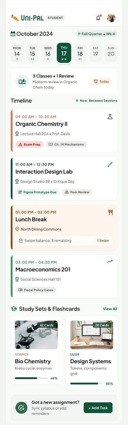
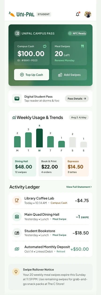
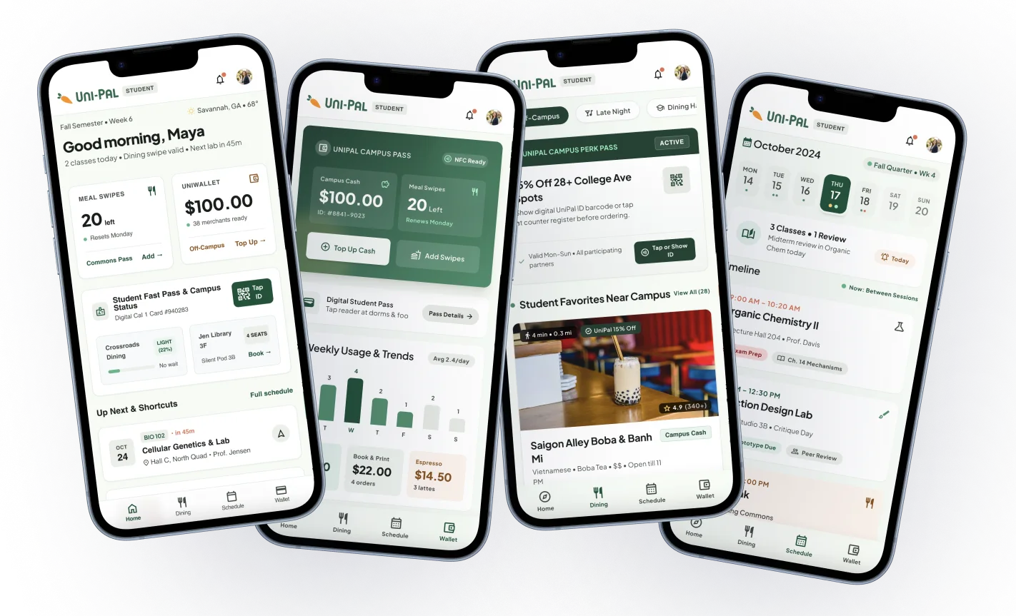
Here is the finished app across its four main tabs. Everything a student juggles on a normal day (swipes, cash, class, and lunch) lives in one place instead of four separate apps.
Scroll inside each phone