A salon website that finally looks as good as the hair, dramatic flip included. I traded a static brochure site for a bold, black and white editorial system built for two audiences: clients booking a treat, and stylists looking for a chair to call their own.
Mérite is a rental-based salon, which means it's really two businesses under one roof. There are the clients, who come in for cuts, color, nails, and a little bit of luxury. And there are the independent stylists, who rent space at Mérite and run their own books. The old website barely spoke to either of them.
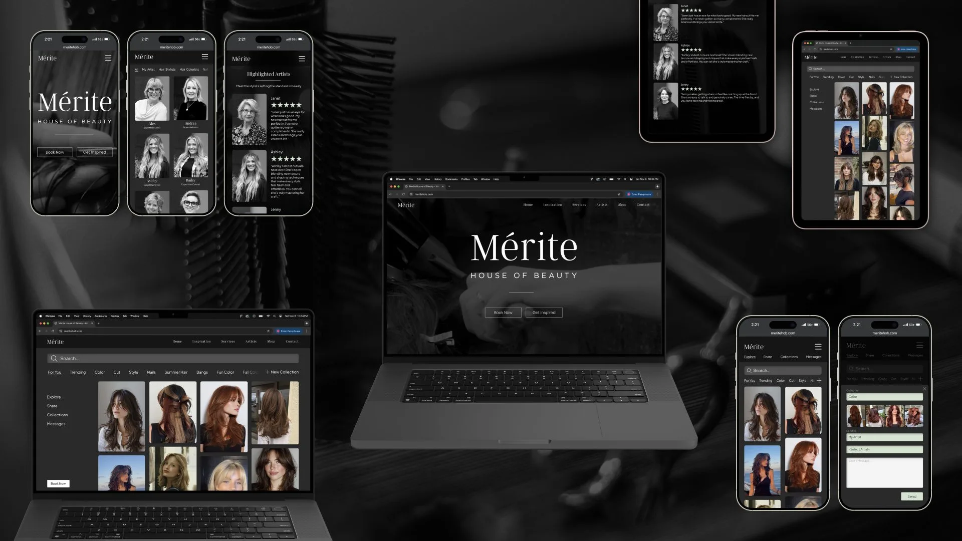
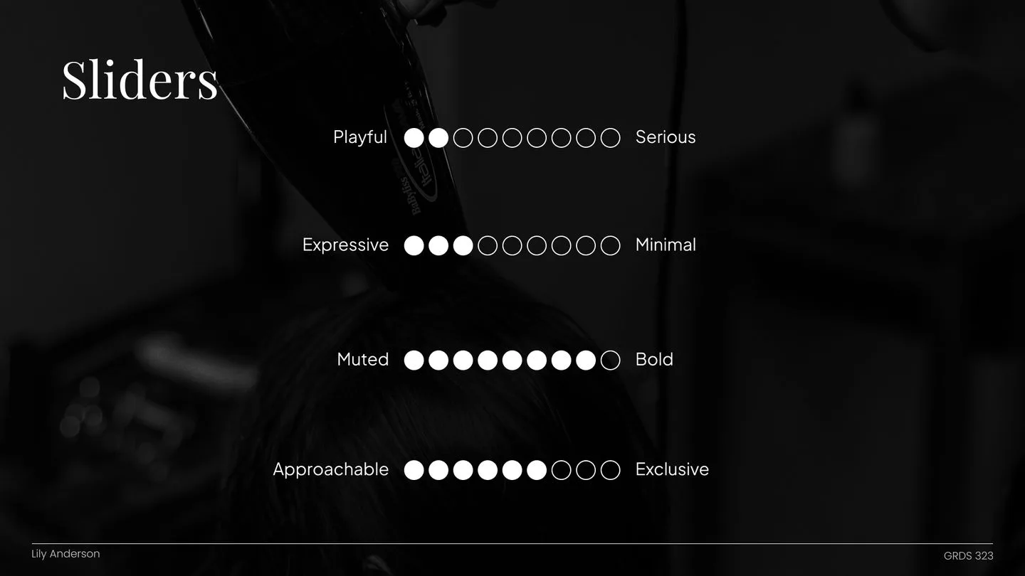
My redesign reimagines the salon's digital identity to match its brand voice: elevated, bold, and a little dramatic. The owner wanted to keep the Mérite color present while giving the site a more dramatic, upscale facelift, so striking black and white visuals sit on top of an intuitive, scalable design system, so the site can grow with the salon instead of getting patched page by page.
01 / RESEARCH
Two audiences, one front door
Before touching visuals, I wanted to know who actually uses this site and what they need from it. I interviewed the salon owner and existing clients to understand business goals, booking behavior, and what people expect from a salon at this level. That turned into user personas, then empathy maps and journey maps that showed where people got excited and where they got stuck. A competitive analysis rounded it out, showing how Mérite stacked up against other salons online.
The owner and the clients wanted different things, but they pointed at the same fix:
The owner wanted to attract more independent renters, since the whole salon model runs on them
The owner also wanted a site that looked better, worked better, and helped the business earn more
Clients wanted the online experience to feel as premium as the one in the chair
The site's information architecture was confusing, and the visual design changed from page to page
Nothing on the site explained what made Mérite different from any other salon in town
Those findings shaped everything that came next: the information architecture, the visual direction, and the overall UX strategy.
02 / PROBLEM
A gorgeous salon with a sleepy website
The existing site didn't capture Mérite's elevated brand, and it didn't really serve either audience. There was no consistent design system, the navigation wasn't intuitive, and nothing highlighted the rental model that makes the salon unique.
The result felt static. It missed easy chances to show off the stylists' work, pull visitors in, and communicate the modern, community-driven vibe you get the second you walk through the actual door.
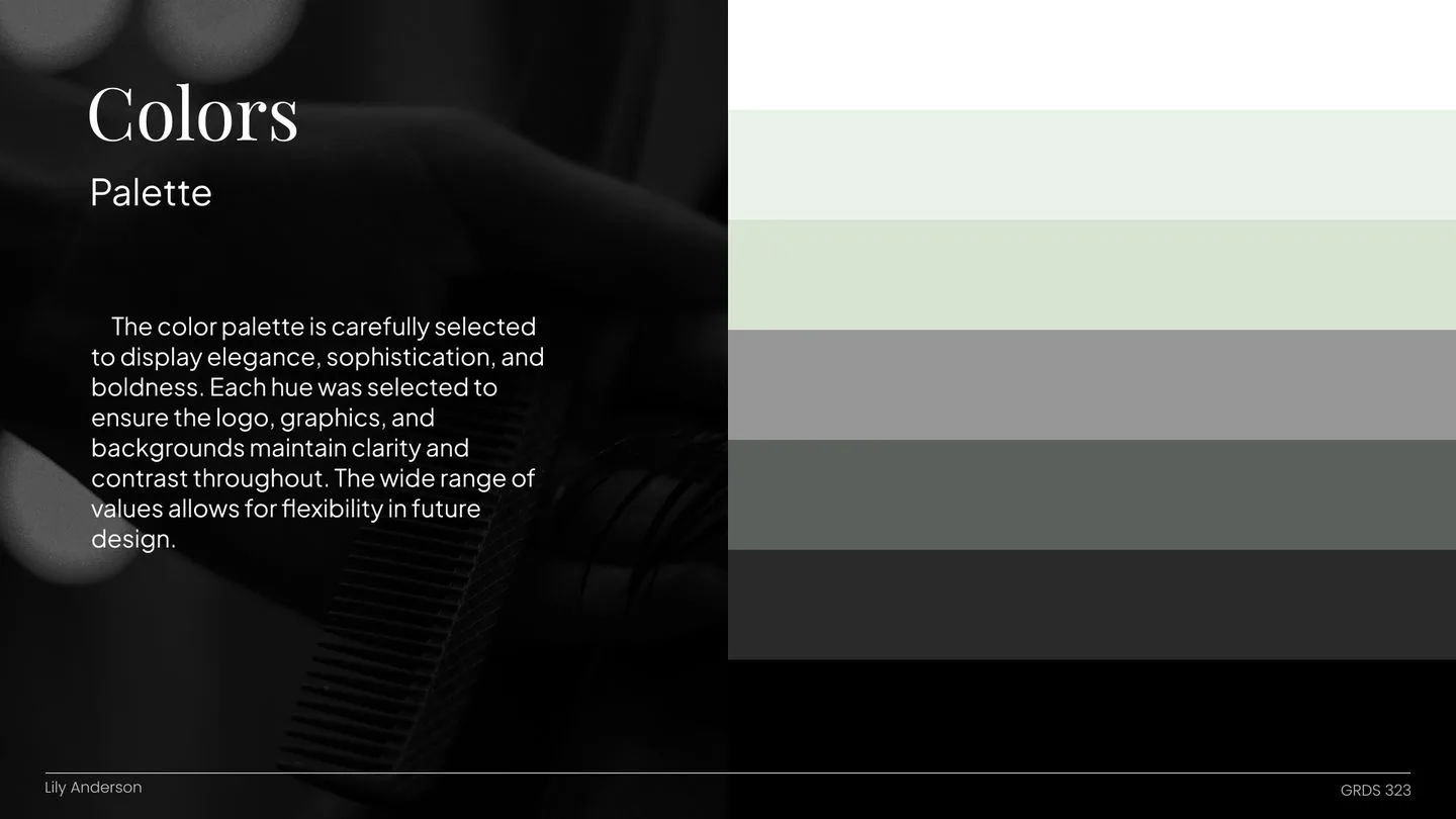
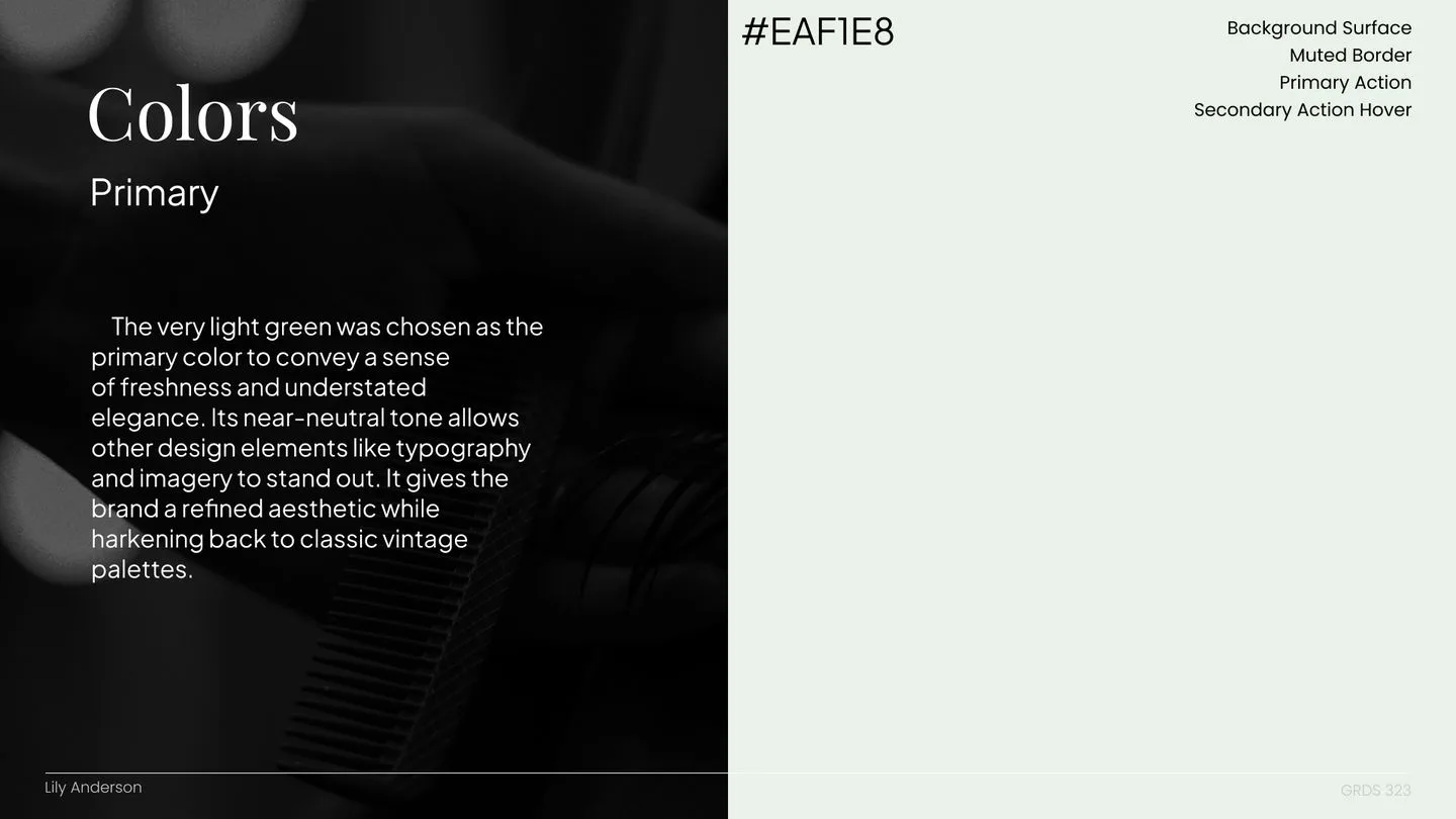
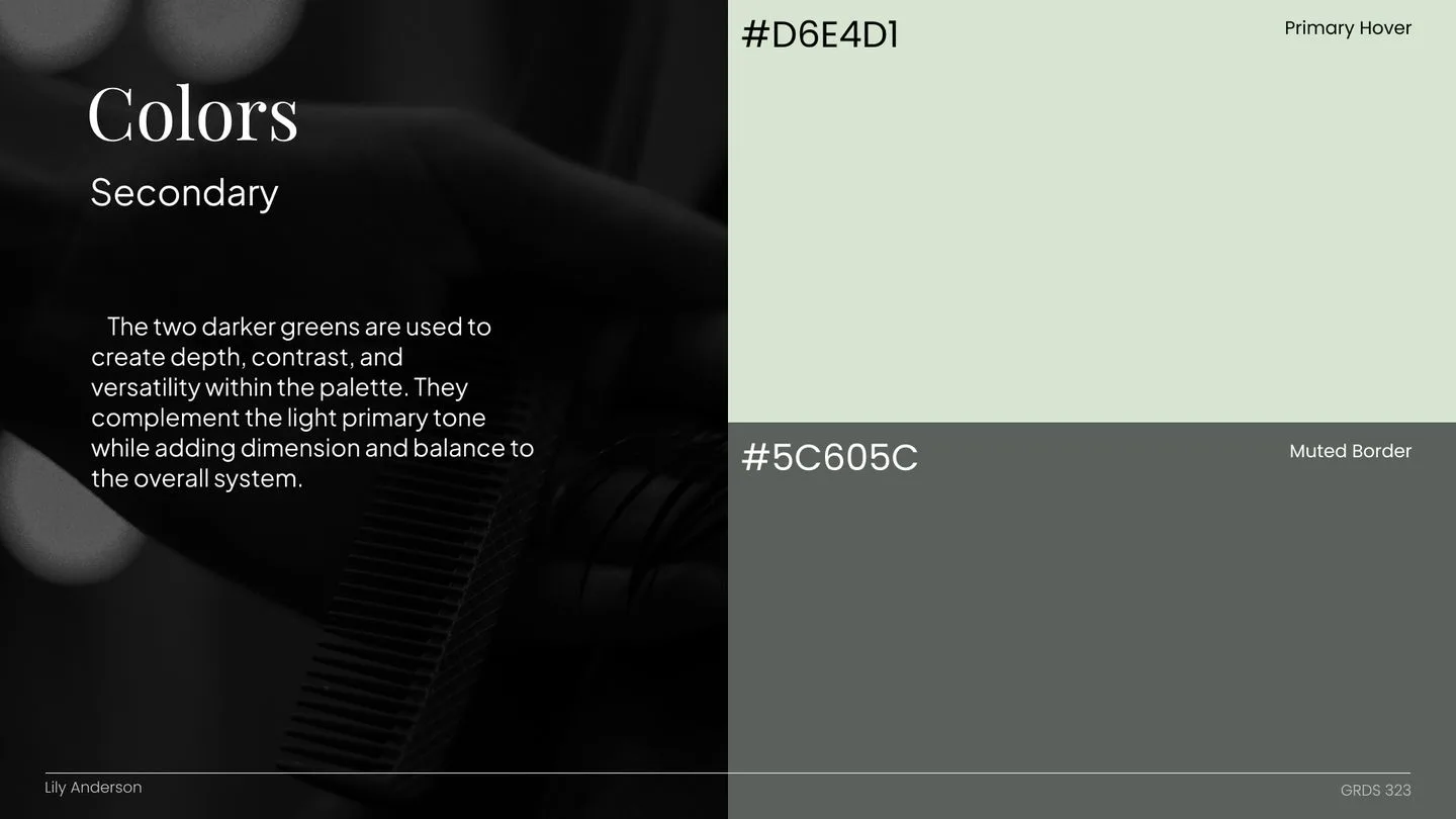
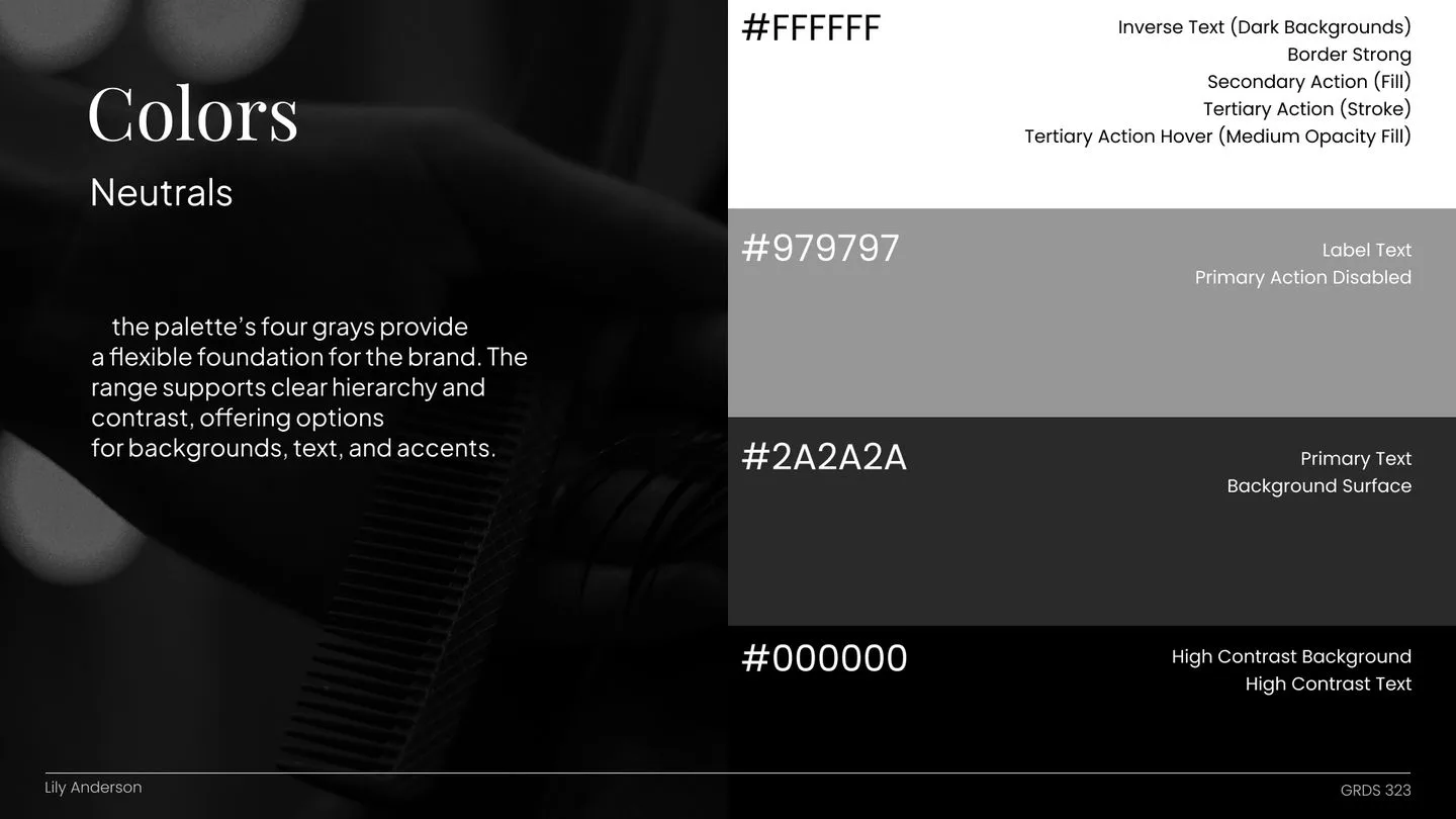
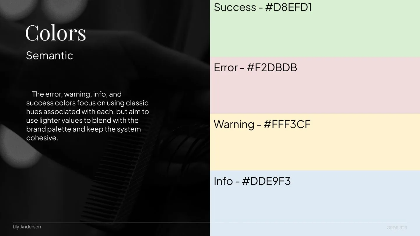
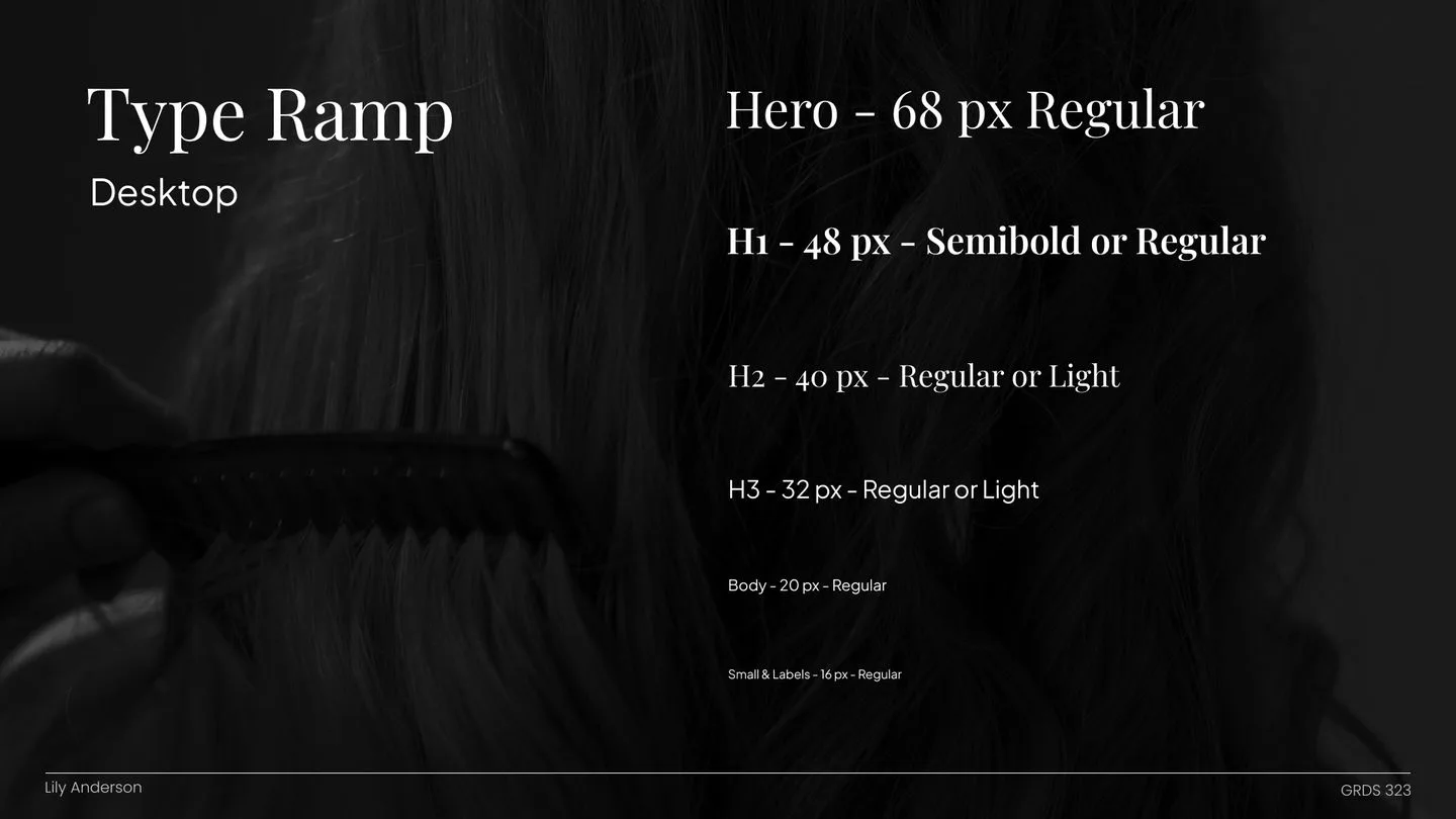
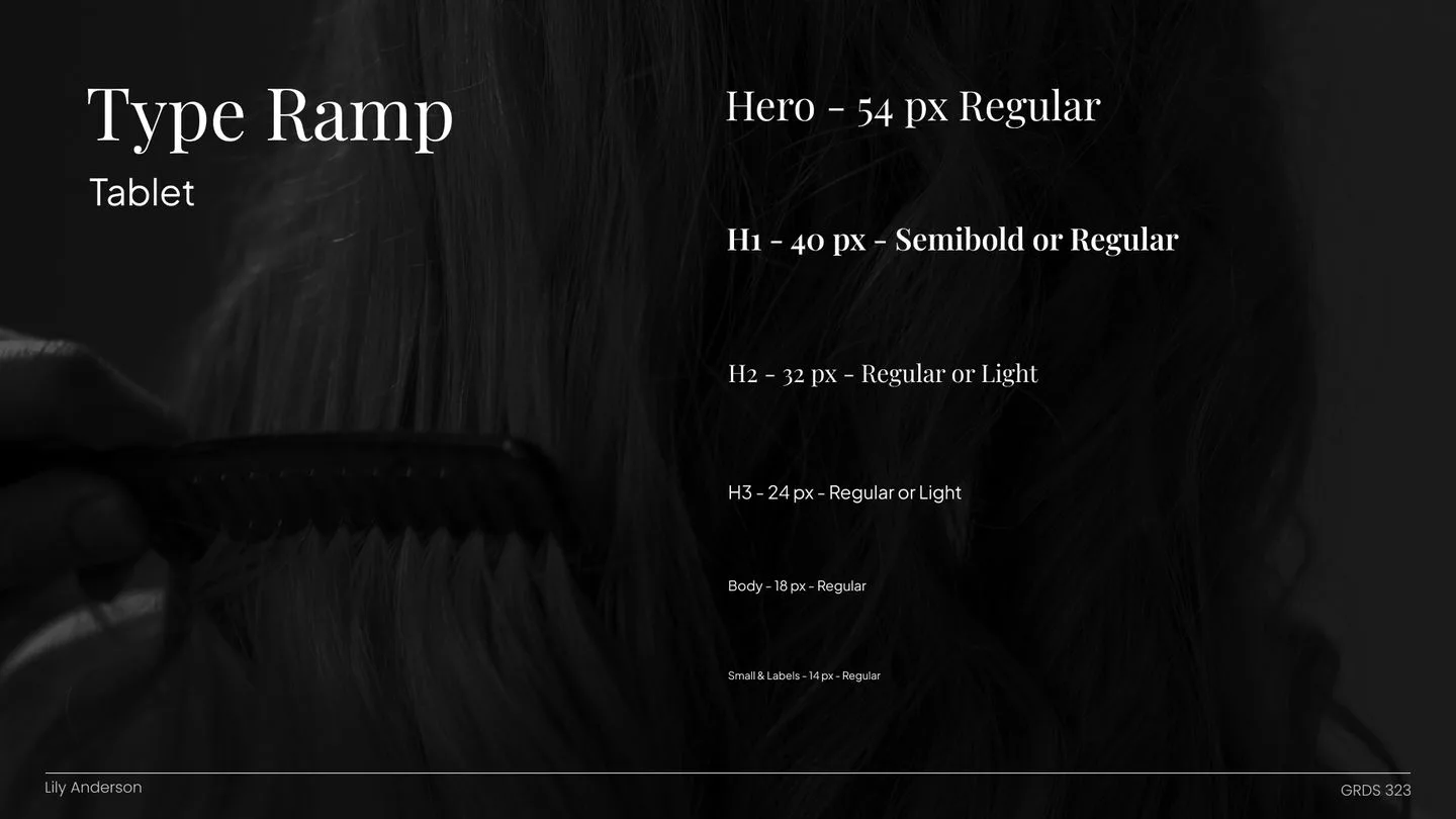
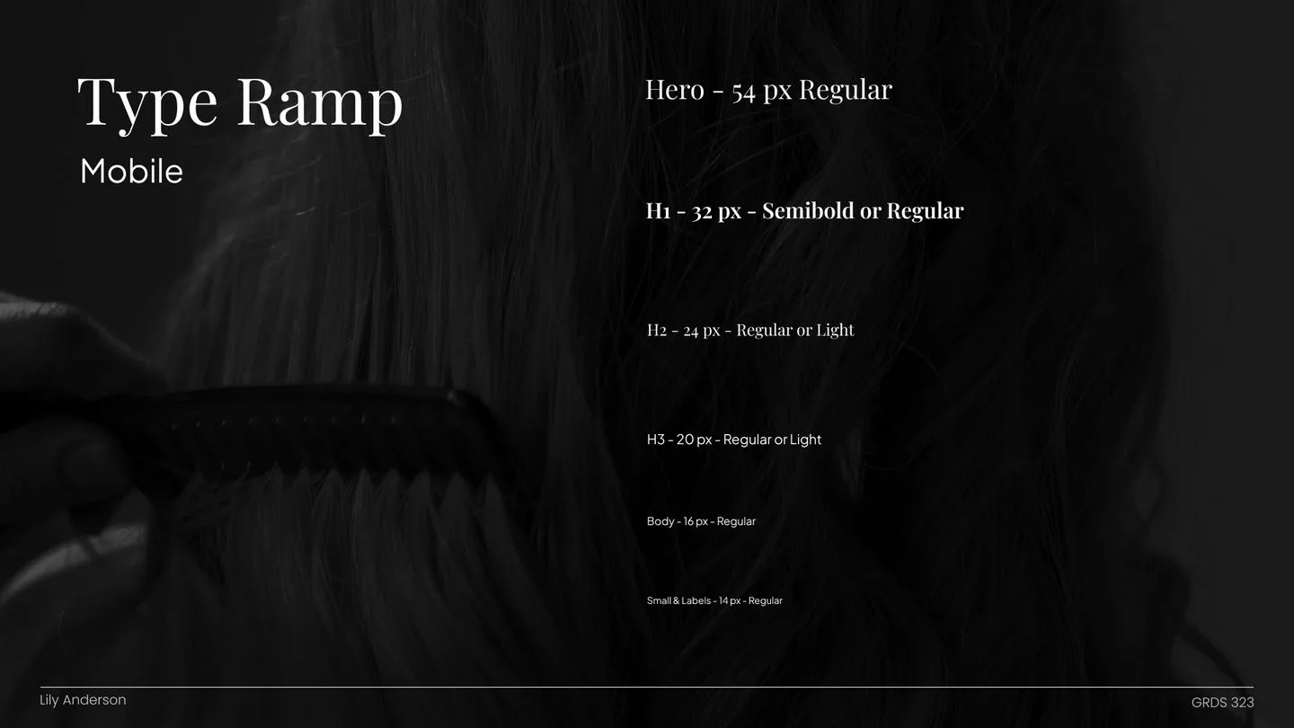
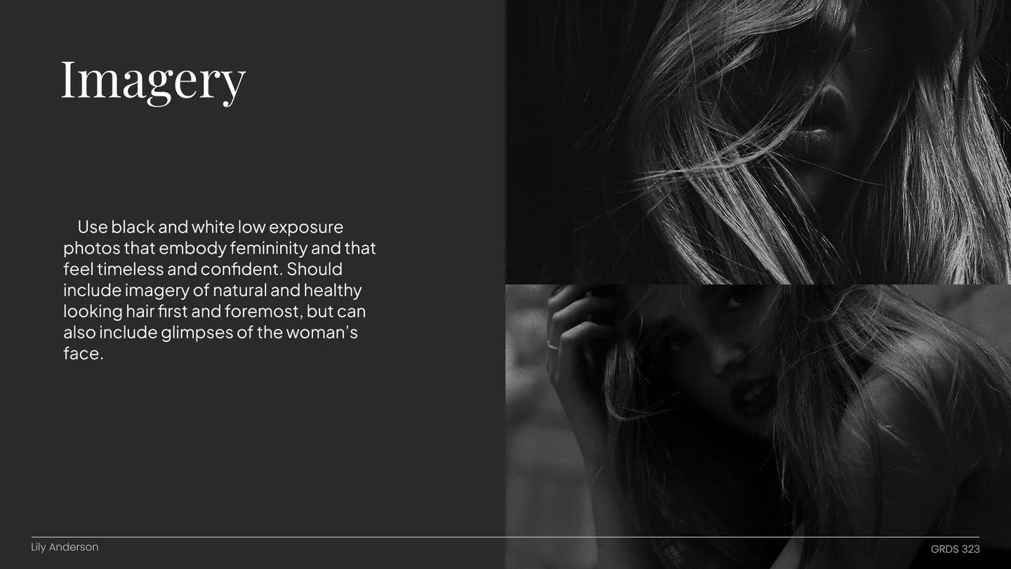
The design system is built around a bold, elevated look that feels modern and stylish. A black and white foundation with soft sage greens, strong contrast, and clean lines give the site an editorial quality, like flipping through a fashion magazine, and it lets the stylists' work do the talking.
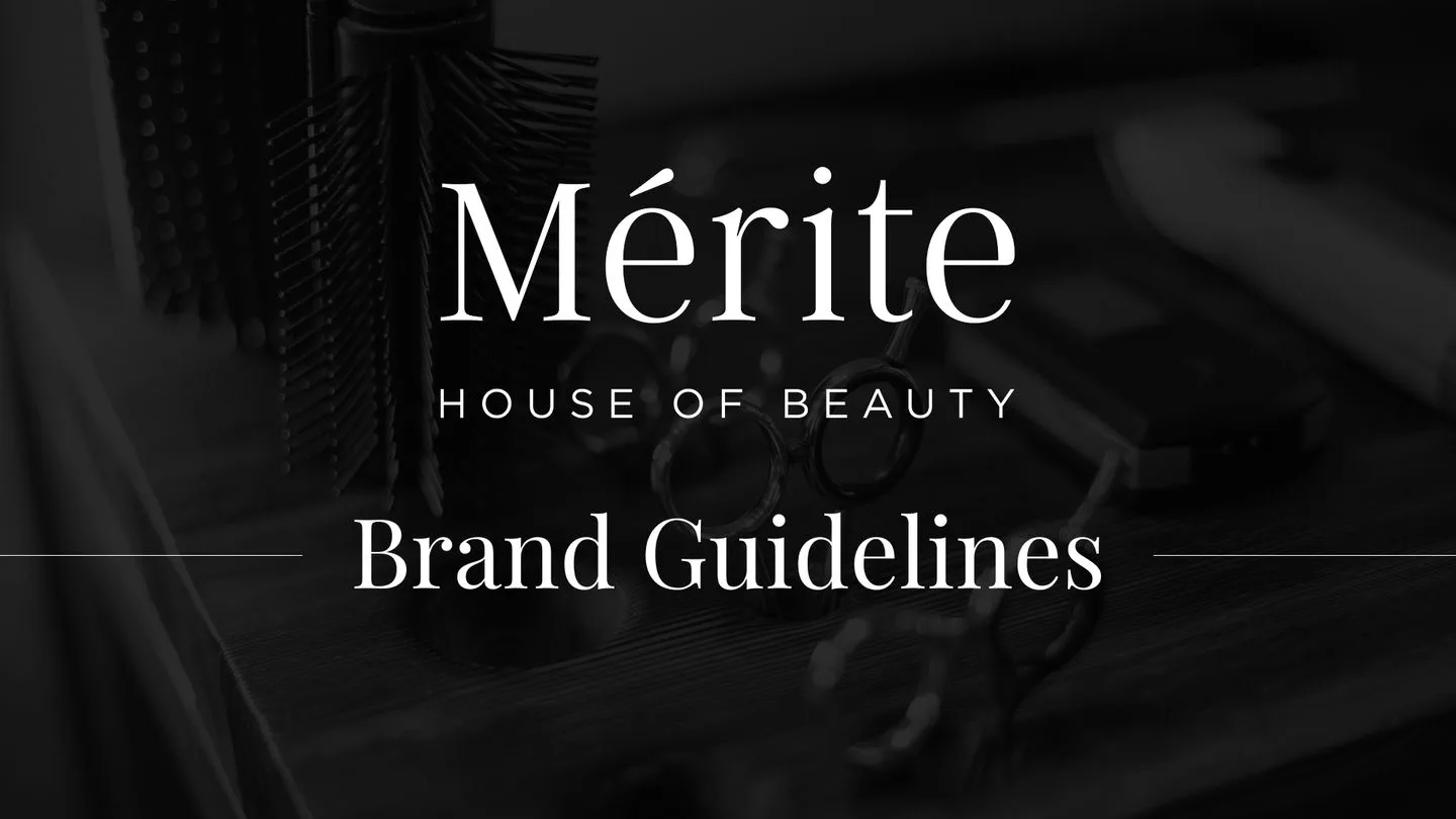
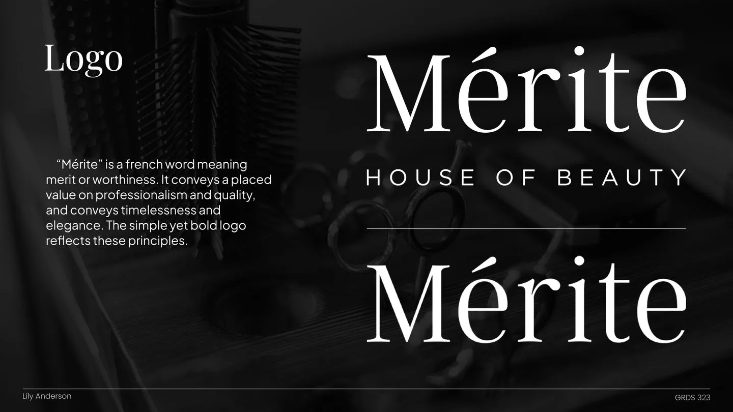
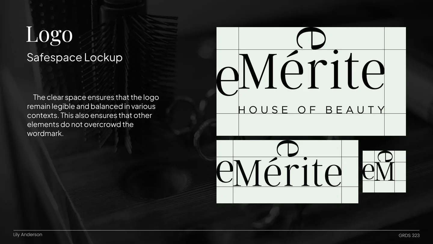
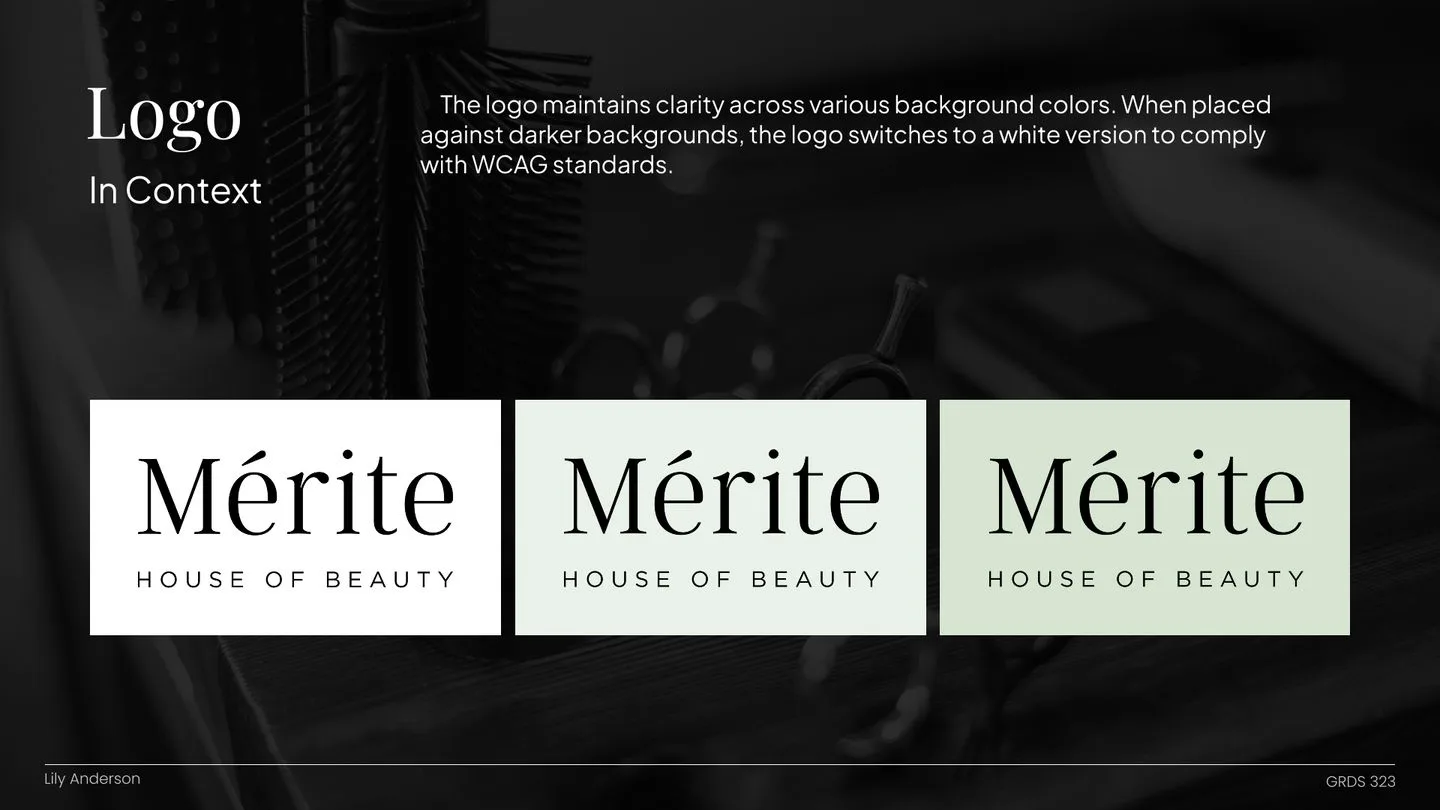
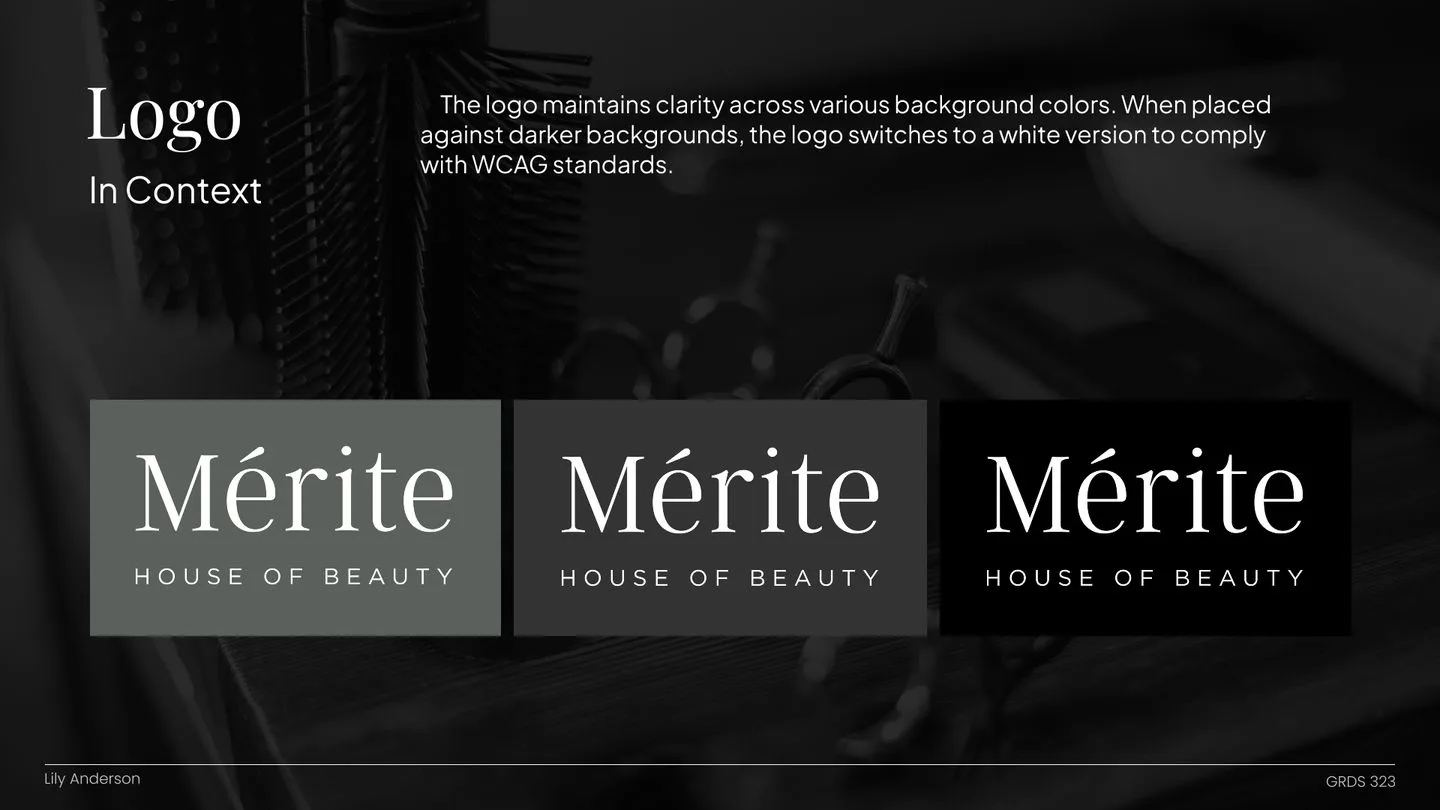
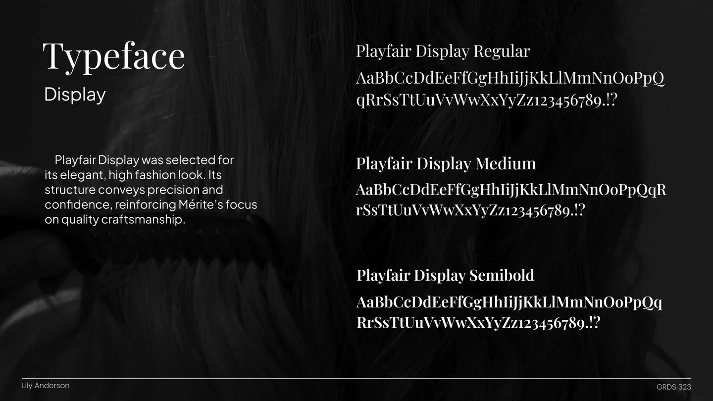
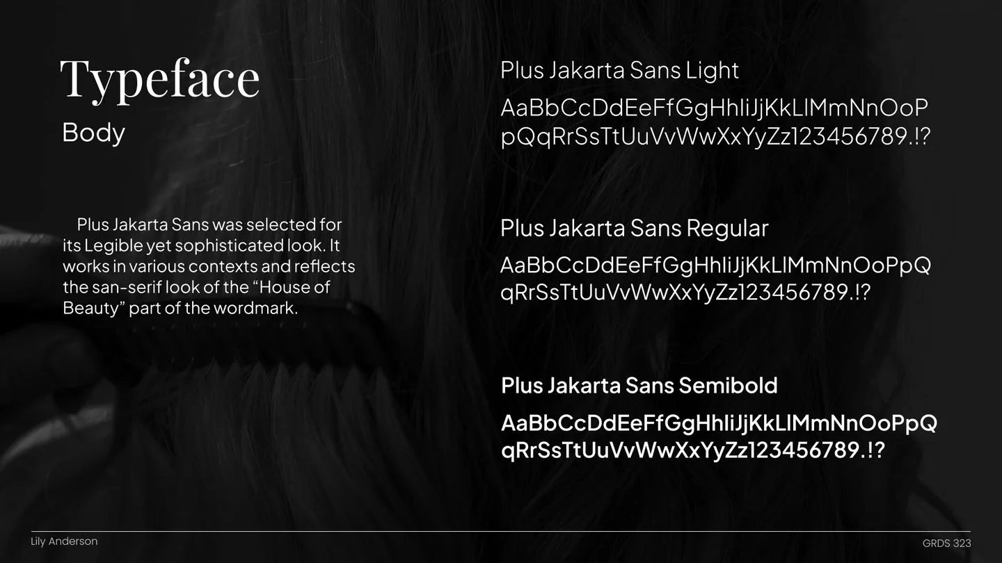
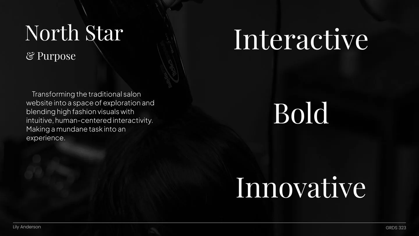
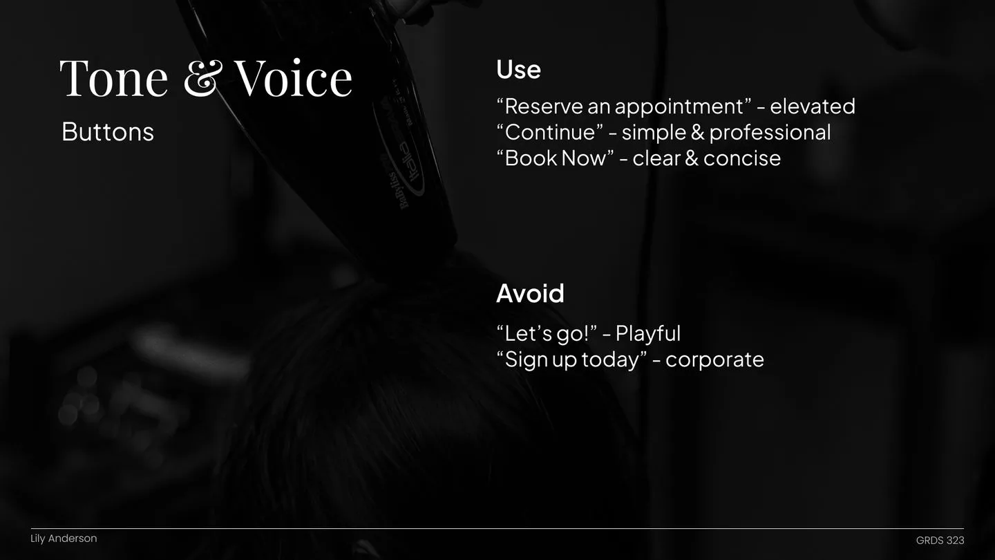
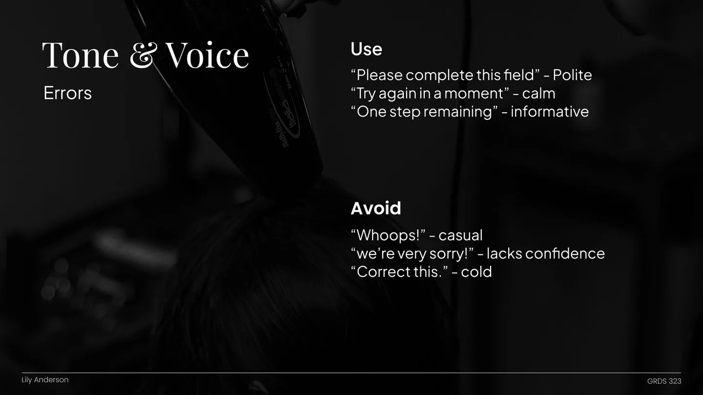
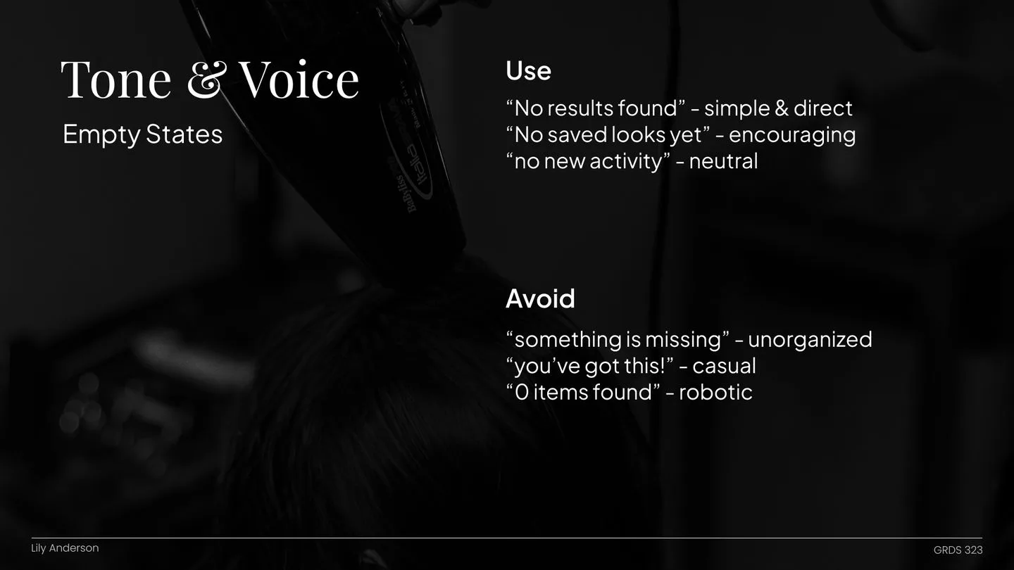
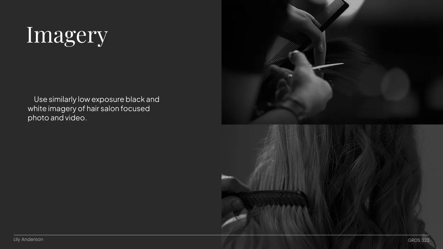
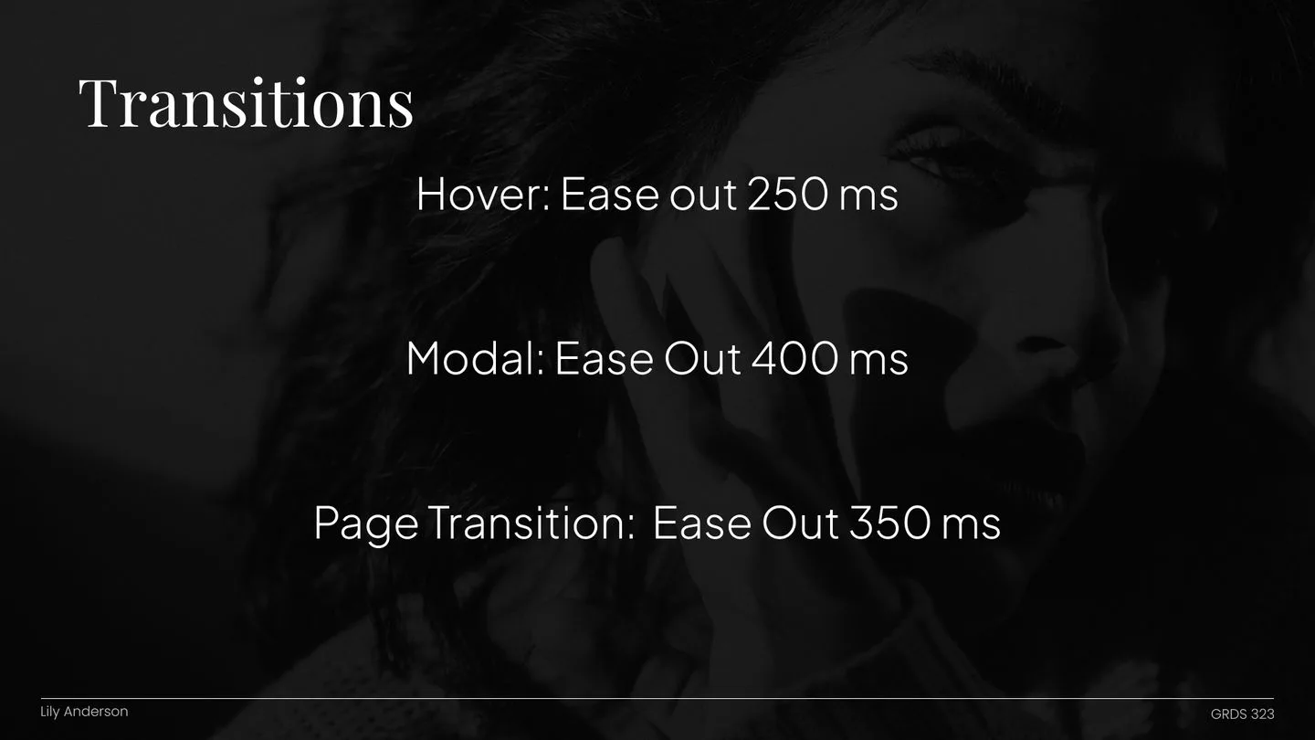
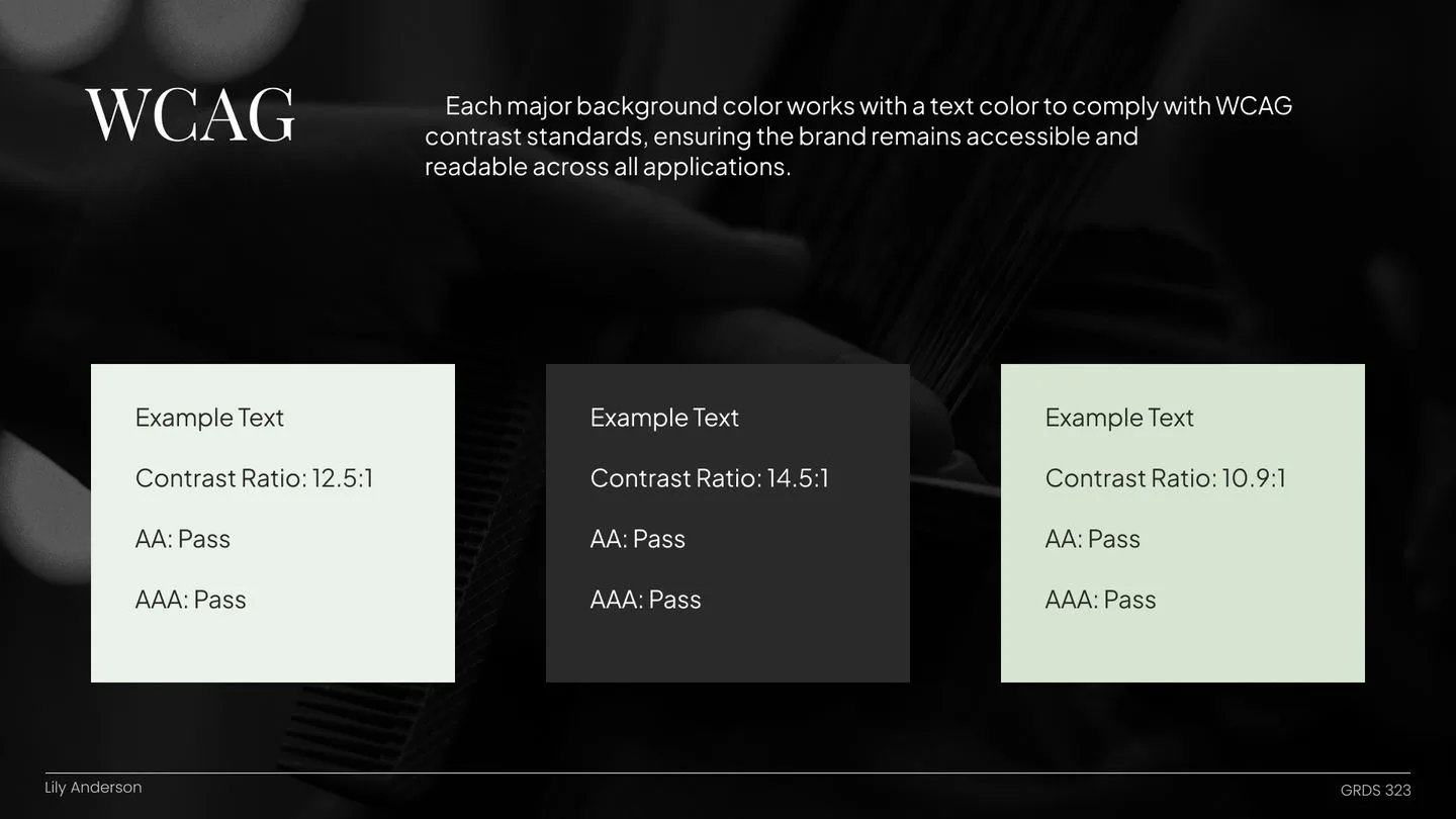
I started by defining the brand's North Star: the core idea and tone every page should carry. From there, the system covers messaging for buttons, errors, and empty states, logo usage with safe-space lockups, logo color across different backgrounds, and scalable logo variations. It also locks in a color palette checked against WCAG accessibility standards, the approved typefaces, and imagery guidelines so the whole site stays cohesive.
1 / 24Brand guidelines cover
05 / UI KIT
Sharp edges, on purpose
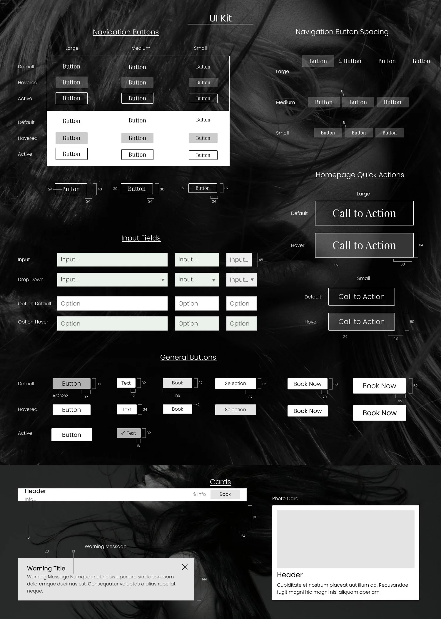
Most UI kits default to soft, bubbly corners. This one barely rounds them at all. Clean cuts only! With almost no color and no soft edges to lean on, hierarchy comes from contrast and spacing instead of decoration, which makes every component feel sharper and more intentional. Buttons, cards, and inputs all share the same straight-edged language, so the system stays cohesive, modern, and easy to read.
06 / SCREENS
Elevated, reliable, innovative
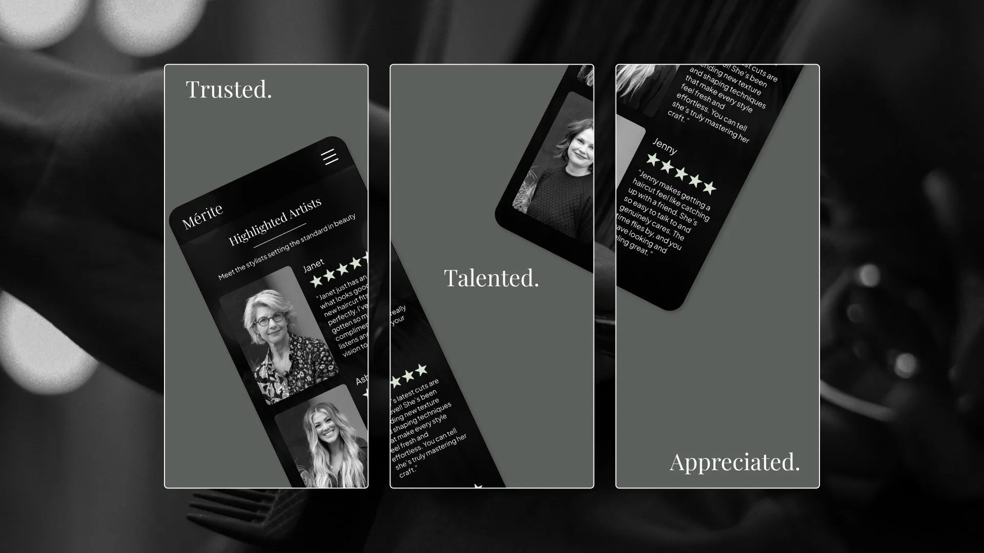
Those three words guided every screen in the redesign. The walkthrough below shows how the final site flows, from first impression to booking. Grab a seat!