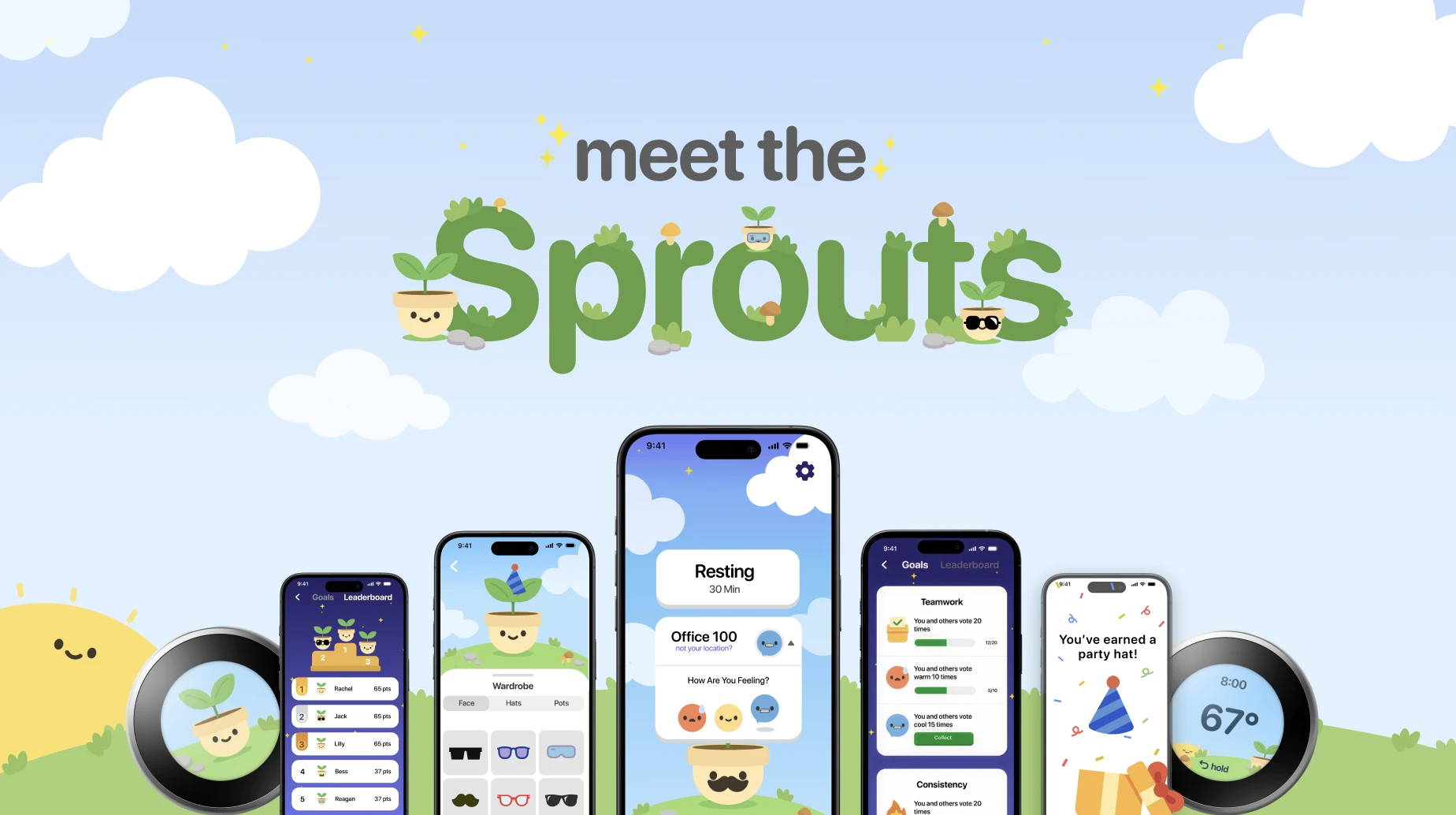
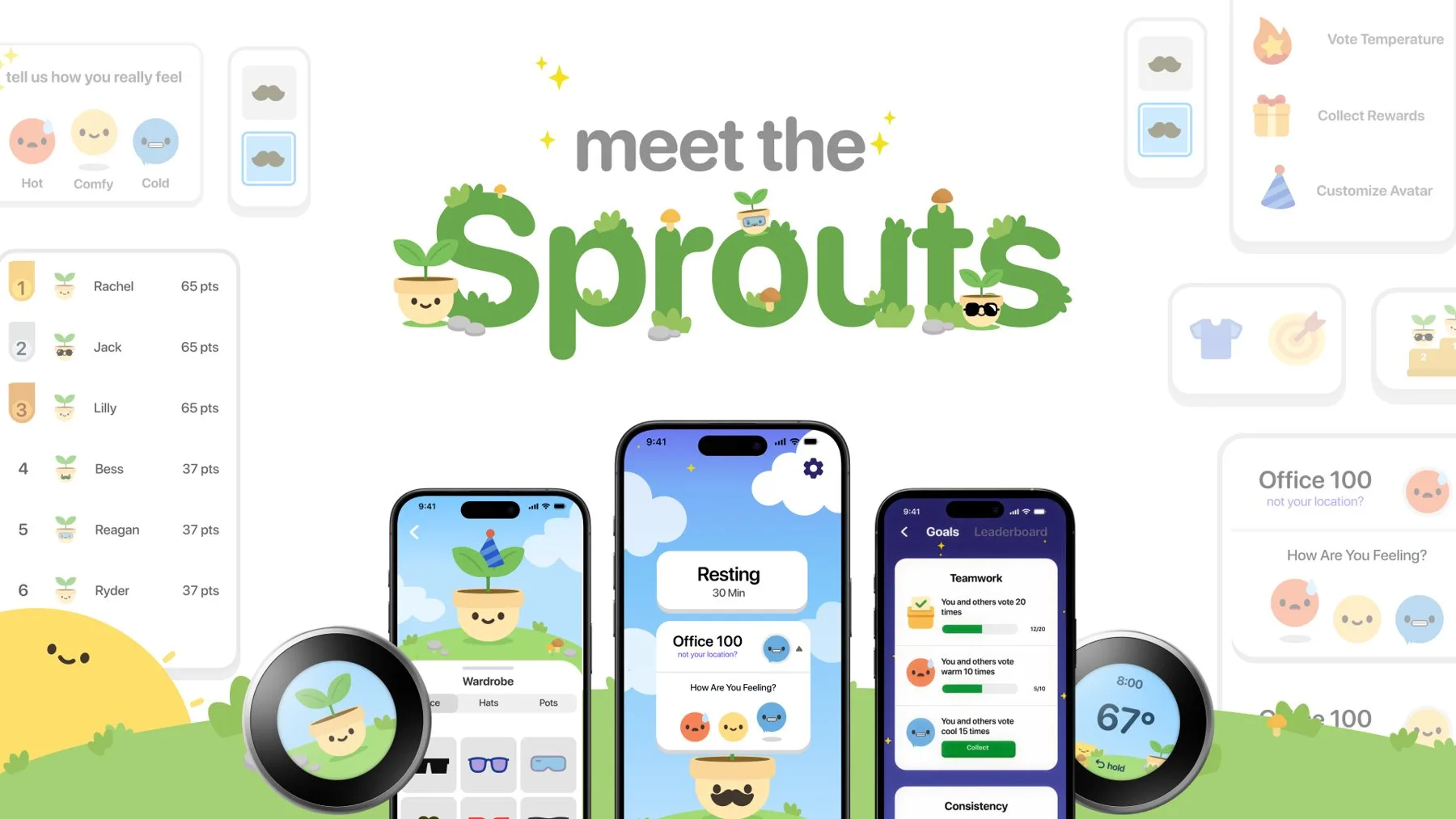
In most offices, one thermostat controls the temperature for everyone. People disagree about it, and whoever sits closest usually decides. Thermostat wars are real! Sprout for Nest is a concept that gives everyone a say.
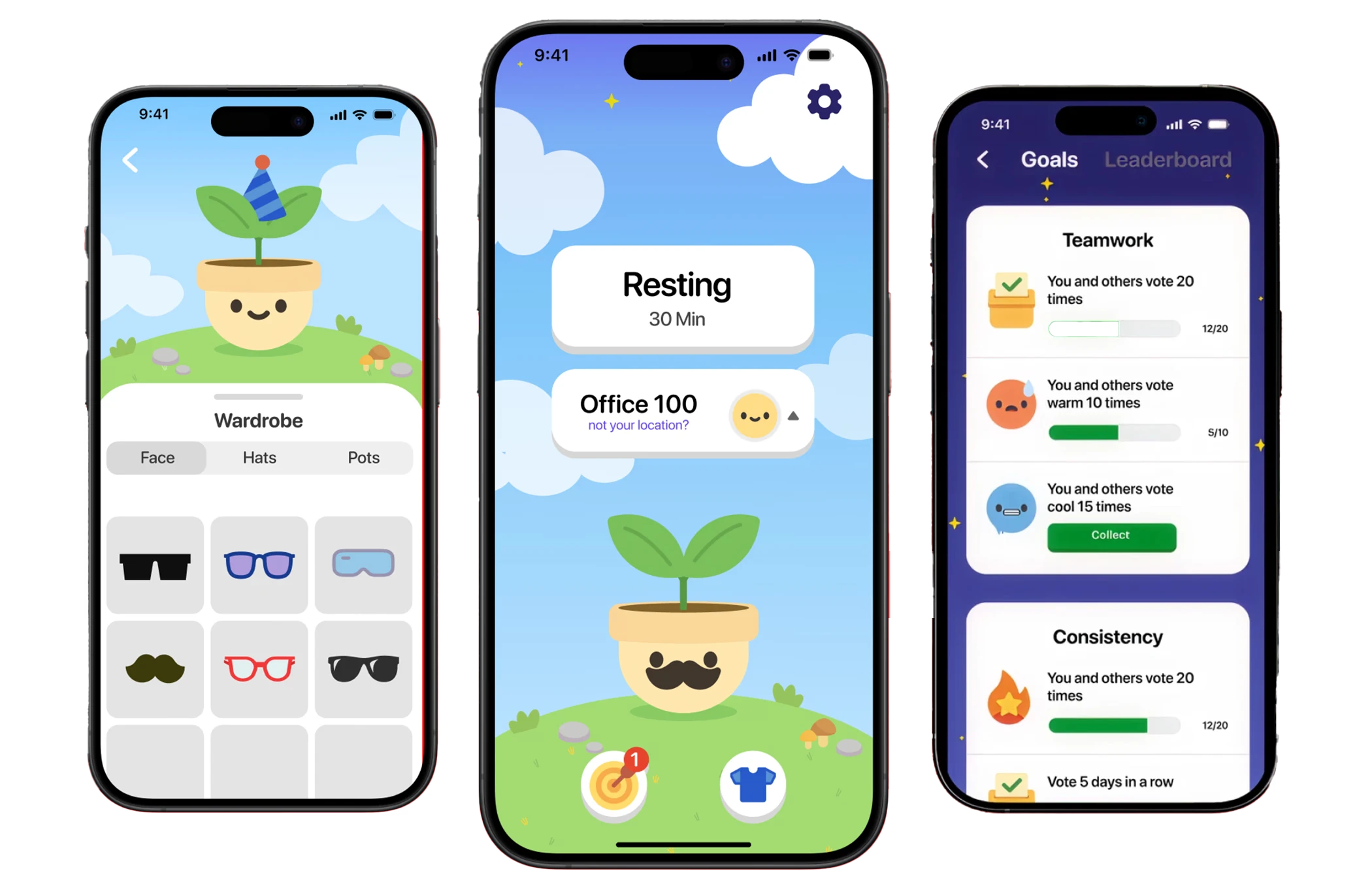
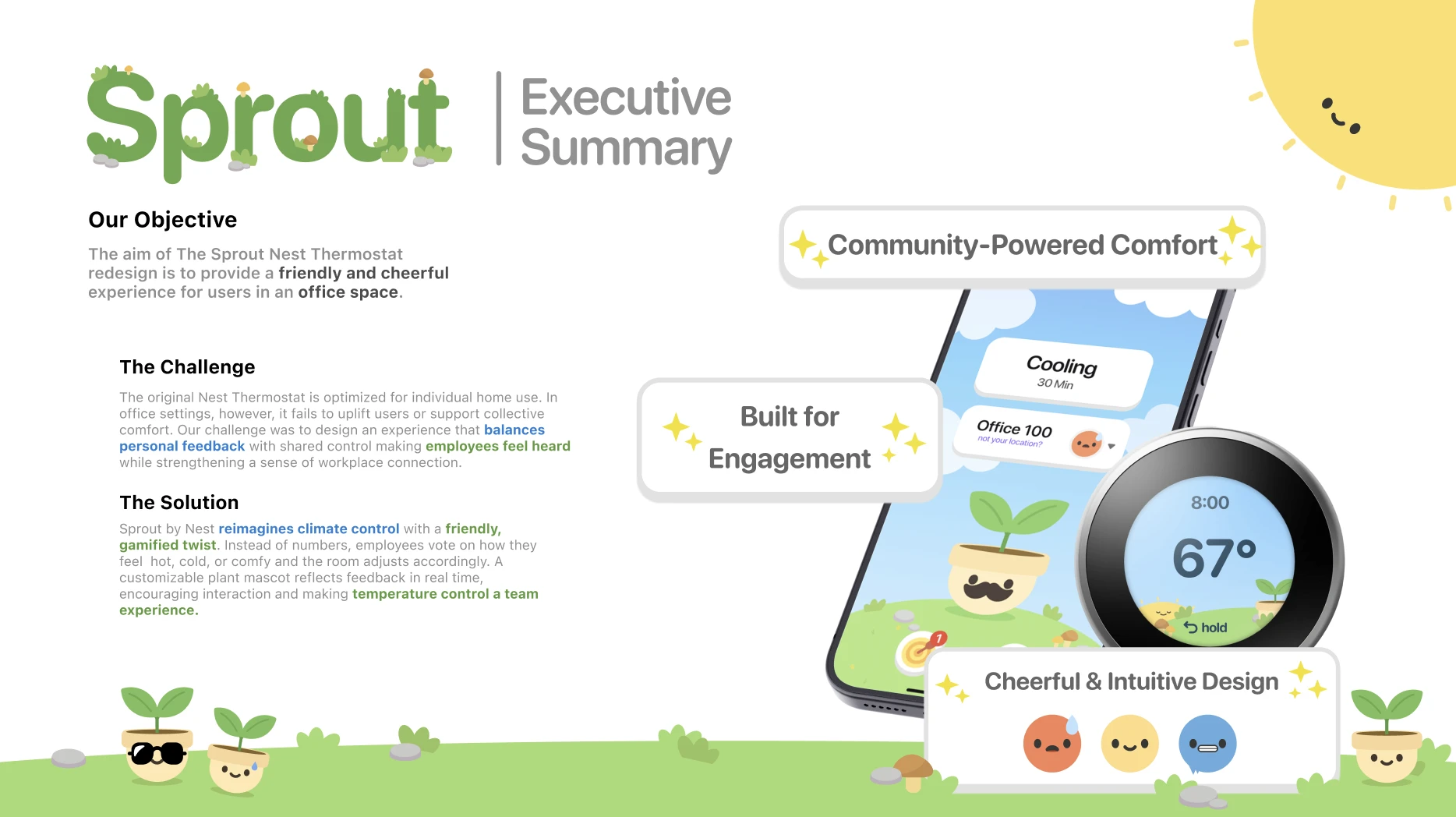
Here's how it works. Each person tells the app if they're too hot, too cold, or just right, and those votes set the office temperature. Along the way, each person grows a small plant character that they can customize by hitting goals (yes, it can wear a hat!).
Our challenge was making it fun without making it harder to use. A thermostat still has to change the temperature quickly when someone needs it to. Nobody wants to level up a plant while their toes are freezing!
Making a thermostat feel friendly
We looked at workplace tools people already use every day and read user feedback on them. We focused on how color, shape, and wording affect whether an interface feels friendly or cold. Very on brand for a thermostat!
What we learned is that small details matter most: rounded shapes, warm colors, and button labels that sound like a person wrote them. These details became our guidelines for everything we designed next.
Deciding what the app and the thermostat each do
Our team drew 360 quick sketches to explore different layouts before designing anything on the computer. Sketching fast let us try a lot of ideas and drop the weak ones early, before anyone got too attached.
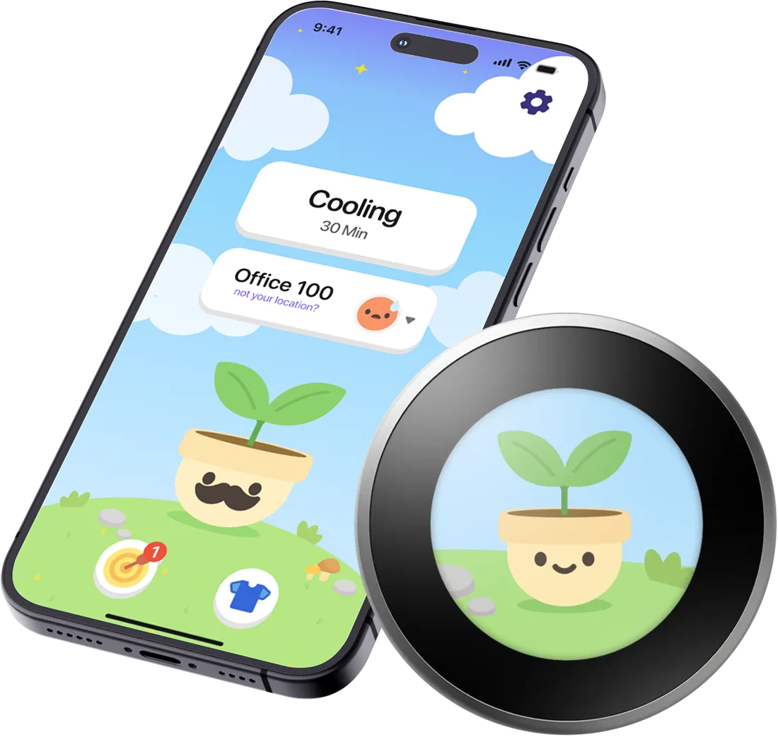
We gave the phone and the thermostat different jobs. The phone is for each individual person. The thermostat on the wall is for the whole office. Both have a manual override, so the game never gets in the way of changing the temperature.
- Vote too hot, too cold, or just right. Everyone's votes set the office temperature.
- Save your usual preferences so the system learns what you like
- Change the temperature yourself with a manual override
- Grow and customize your own plant character
- Unlock hats, pots, and faces for your plant by hitting goals
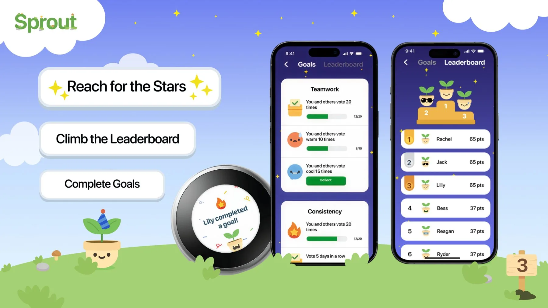
- See a leaderboard for some friendly competition (bragging rights included!)
- Shows everyone's plant characters, one at a time
- Celebrates on screen when a teammate reaches a goal
- Has a physical dial for manual override
Testing and improving the design
We made many versions of the screens. For each one, we tested it with users, saw what worked and what confused them, and made changes. Testing showed us where the playful parts helped and where they made the controls harder to understand.
Since several designers were working on the screens at once, we built a shared library of reusable UI components that anyone on the team could adjust and reuse. This kept every screen looking and working the same way. No rogue buttons allowed!
Final deliverables
We finished the project with a full set of pieces that present the concept:
- Prototype: a working walkthrough of the app that shows how its features function
- Style guide: the colors, fonts, and visual rules for the brand
- Executive summary: the project's goals and results in a short document
- Print pieces: a cookbook, a magazine, and a poster in the Sprout style (we really committed to the bit!)
The print pieces showed that the brand's look and tone still worked outside of the app.