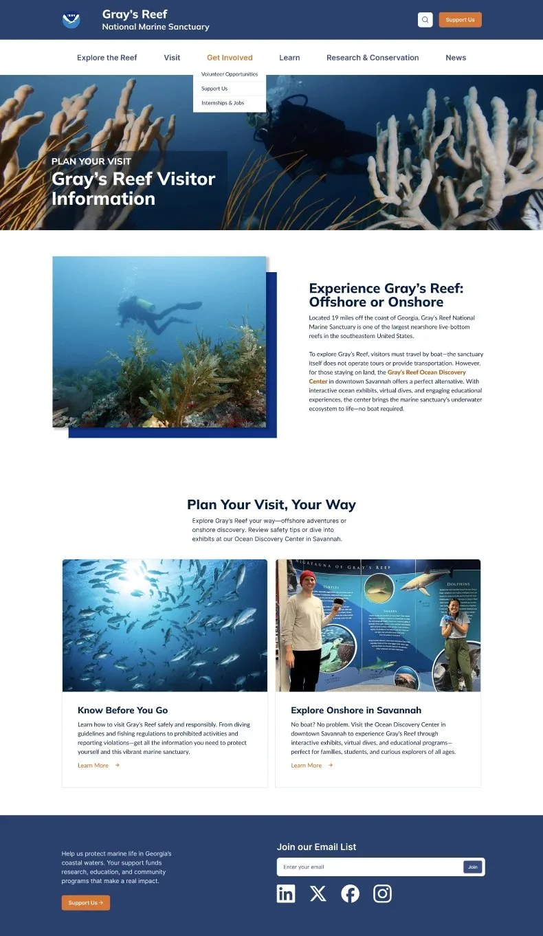
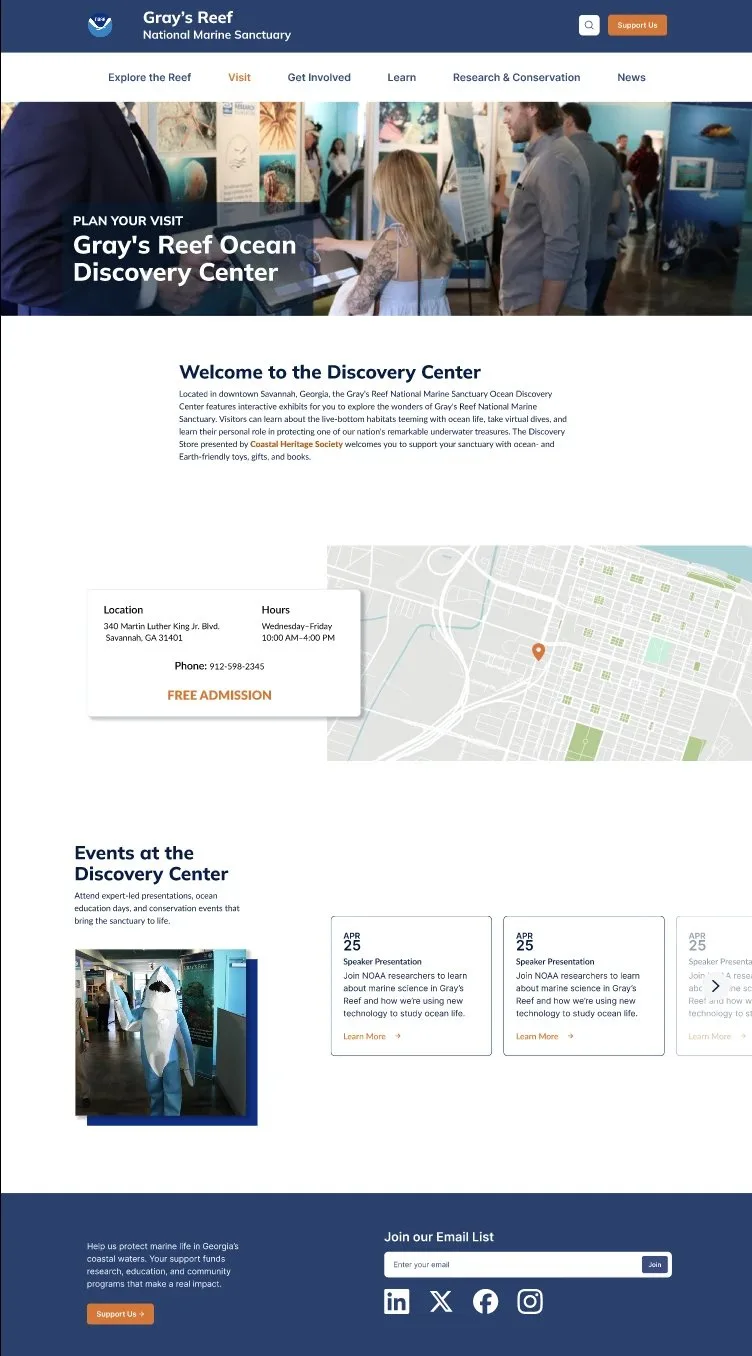
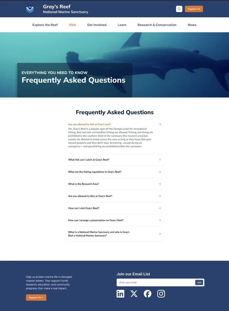
Gray's Reef sits nineteen miles off the Georgia coast, and most people who visit the website will never get in the water to see it. So the site has to do double duty: give divers and boaters the logistics they need, and give everyone else (students, families, people who just heard "national marine sanctuary" and got curious) a real way in through the Ocean Discovery Center in downtown Savannah. The existing site wasn't doing either job well. Information was scattered across pages that didn't match how visitors actually thought about a trip, so we rebuilt the site's structure from the ground up (or the seafloor up, fittingly) and gave it a visual identity that felt like the reef instead of a generic government page.
This was a research-heavy project for me specifically. I ran interviews with visitors and staff, built out the personas, structured the card sort, and translated what we heard into the new site map before a single wireframe got drawn.
Talking to the people who live with this site
We started by mapping the landscape: a market analysis and competitor SWOT looked at what similar sanctuary and aquarium sites do well, and it was clear early on that Gray's Reef shouldn't try to out-aquarium an actual aquarium. Its real advantage is that it's a working NOAA research site with a free, no-boat-required way to experience it downtown, and almost nobody visiting the old site could tell that. We built personas around that gap, to keep the team designing for real visitor types instead of one imagined "user."
From there we went straight to the two groups who actually live with the site: visitors trying to plan a trip, and staff who field the questions the site should be answering but isn't. Semi-structured interviews with both sides kept surfacing the same problem from opposite ends: people assumed they could just boat or dive out to the reef on their own, and staff were tired of explaining, again, that they couldn't.
A heuristic evaluation caught the smaller usability issues (buried navigation, vague labels, pages that dead-ended, a little too much like running aground), while card sorting sessions with actual users gave us a structure based on how people group this content in their own heads, not how it happened to be organized internally. That combination is what justified rebuilding the information architecture before we touched a single wireframe.
What we kept hearing, over and over:
- Visitors assumed they could dive or boat out to the reef on their own, with no idea that access is restricted and requires your own vessel
- The Discovery Center read as an afterthought, when for most visitors it's actually the main way to experience the sanctuary
- Staff answered the same handful of visit-planning questions on nearly every call
- Research and conservation content was buried, even though it's what makes Gray's Reef different from a typical aquarium
The card sort results reshaped the entire top-level navigation into something that matched those mental models: Explore the Reef, Visit, Get Involved, Learn, Research & Conservation, News. Simple on the surface, with plenty of depth underneath: every one of those labels came out of watching where people actually put things, not a guess.
Two different homepages, on purpose
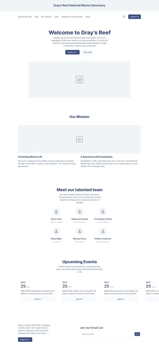
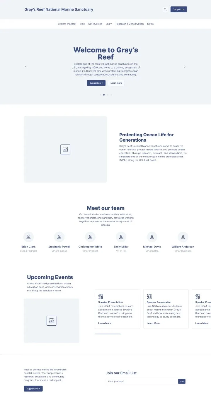
Low-fidelity sketches let us kill bad layout ideas cheaply, before navigation and content hierarchy got expensive to change. From there we built two clearly different mid-fidelity directions for the homepage instead of one "safe" version: one leaned into a classic hero-plus-mission layout, the other tried a tighter, carousel-driven approach that led with a split content block and pushed the team and events sections higher up the page.
Testing both against each other, instead of testing one version against nothing, is what actually told us which hierarchy people could parse faster. Every direction still had to support the two flows research kept pointing to: planning an actual visit, and browsing what the sanctuary and Discovery Center offer before committing to anything. If a layout slowed either of those down, it didn't make it to the next round.
Watching people use it, then scoring it
We put working prototypes in front of users and ran structured sessions built around three kinds of evidence: observational notes on where people hesitated or backtracked, the System Usability Scale to get an actual comparable number across rounds, and short post-session interviews to catch anything the score alone wouldn't explain. Behavior, a number, and their own words in the same session, so we weren't overreacting to one rough session or one glowing comment.
Fixing what testing actually flagged
Testing turned up a short list of specific, fixable problems rather than a reason to jump ship, which felt like a good sign the earlier research had done its job. We tightened labels people misread during sessions, moved Discovery Center visit information higher up since that's what almost everyone actually needed first, and cleaned up the couple of navigation spots the original card sort data hadn't fully settled.
Where it landed
The finished site keeps NOAA's blue front and center, since that's a trust signal worth keeping, but treats it less like a government brochure and more like a place worth spending time on. The Visit page leads with the split research kept surfacing: go offshore if you can get to a boat, or come downtown to the Discovery Center if you can't, no boat required either way. The FAQ page absorbed a lot of what staff used to repeat on the phone, built as an accordion so people can scan instead of wading through paragraphs looking for the one line that answers their question.