Toast runs the point of sale for thousands of family-owned restaurants, and its handheld is where servers spend their whole shift. It is also where things go sideways: modifiers get lost, checks get split wrong, and managers get pulled in to fix it.
We redesigned the server experience around the three biggest pain points (splitting checks, modifiers, and menu navigation) and built a design system to match. In our second round of testing, split check success rose from 66% to 86%, and 86% of participants said our version beat the system they use today.
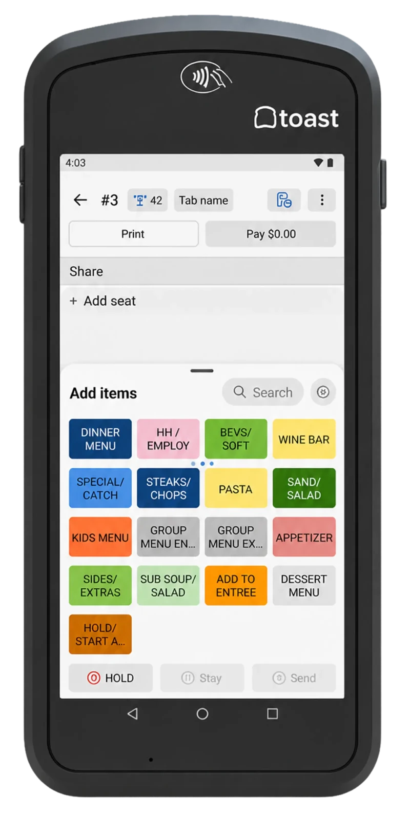
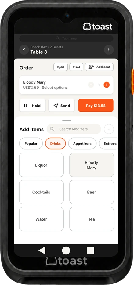
Toast has a retention problem
Toast is a cloud-based POS built for restaurants. It is losing ground to competitors like Square and Clover, who win on three things: a cleaner UI, easier setup, and iOS compatibility.
That matters because of how POS contracts work. When a contract ends, a restaurant can simply not renew, and voluntary switches are climbing by as many as 750 per month. Every one of those is a restaurant that decided the product wasn't worth keeping.
Our goal: improve the server experience enough to keep current clients loyal, help restaurants earn more per table, and make Toast more appealing to restaurants shopping around.
How we sized it. Using public analyst figures, Toast has about 60,000 restaurants on 12 to 24 month contracts. If roughly 15% don't renew in a cycle, that's about 9,000 restaurants (around 750 a month). At roughly $102,500 in revenue per customer, that adds up to about $923M a year if those clients aren't replaced. Not exactly crumbs! It's our estimate, not an official Toast number, but it made the stakes very clear: a small usability win for servers is a big deal at that scale.
Servers can't take and manage table orders efficiently. That sounds small until you follow it downstream. More user errors. More manager involvement. Slower order fulfillment. Slower table turnover. And when tables turn slower, restaurants make less money, which makes Toast look less valuable, which is exactly how you end up with a non-renewal.
- Business problem: Usability issues make it hard for restaurants to get the most revenue out of their tables. That hurts how Toast is perceived, lowers client return rate, and puts off potential clients.
Numbers and stories, side by side
We used four methods across the project, and each one was chosen to answer the question the last one couldn't.
- 1. Survey. Told us what hurts: modifiers, menu navigation, and splitting checks. It couldn't tell us why people get stuck or what they'd do differently.
- 2. Interviews. Confirmed the survey rankings, produced our personas, and uncovered why these pain points affect staff. They couldn't tell us if a revised structure would actually be easier to find things in.
- 3. Tree test. Validated our revised sitemap and exposed confusion around menu navigation and modifier labels. It couldn't tell us if the structure would be findable on a real screen.
- 4. Prototype testing. Validated our relabeled modifier menu and surfaced big problems with splitting checks manually.
Here's what the first two methods found.
We asked what frustrates people most about Toast.
Twelve interviews produced 394 data points. When we sorted the pain points, the biggest buckets were splitting checks (10%), user errors (9%), learning the system (9%), and complex UI and navigation (7%). The quotes did the rest of the talking.
"Splitting a check? That is probably the most difficult thing to learn."
"There was no onboarding experience. I did train with people that worked there."
"Sometimes servers ring something on a check and then it won't get sent."
"I feel like Toast is doing so many things and trying to give you so many options that it's just information overload."
What we learned
Three themes kept coming back:
- Frequent errors when taking and modifying orders.
- Hard-to-manage tickets. Keeping track of individual orders in a large party, splitting checks, and charging the right card.
- Slow interactions while navigating during a busy shift.
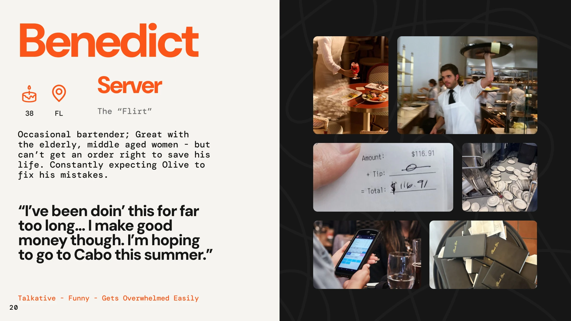
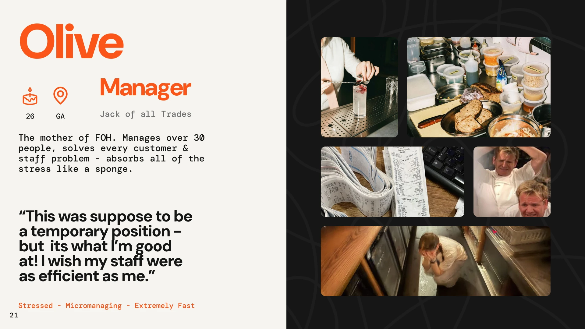
Left alone, these turn into delayed service, manager interruptions, unhappy guests, and lost revenue. We turned the findings into two personas, a server and a manager, so we could keep designing for real people when the debates got abstract.
Deciding what to fix, with math
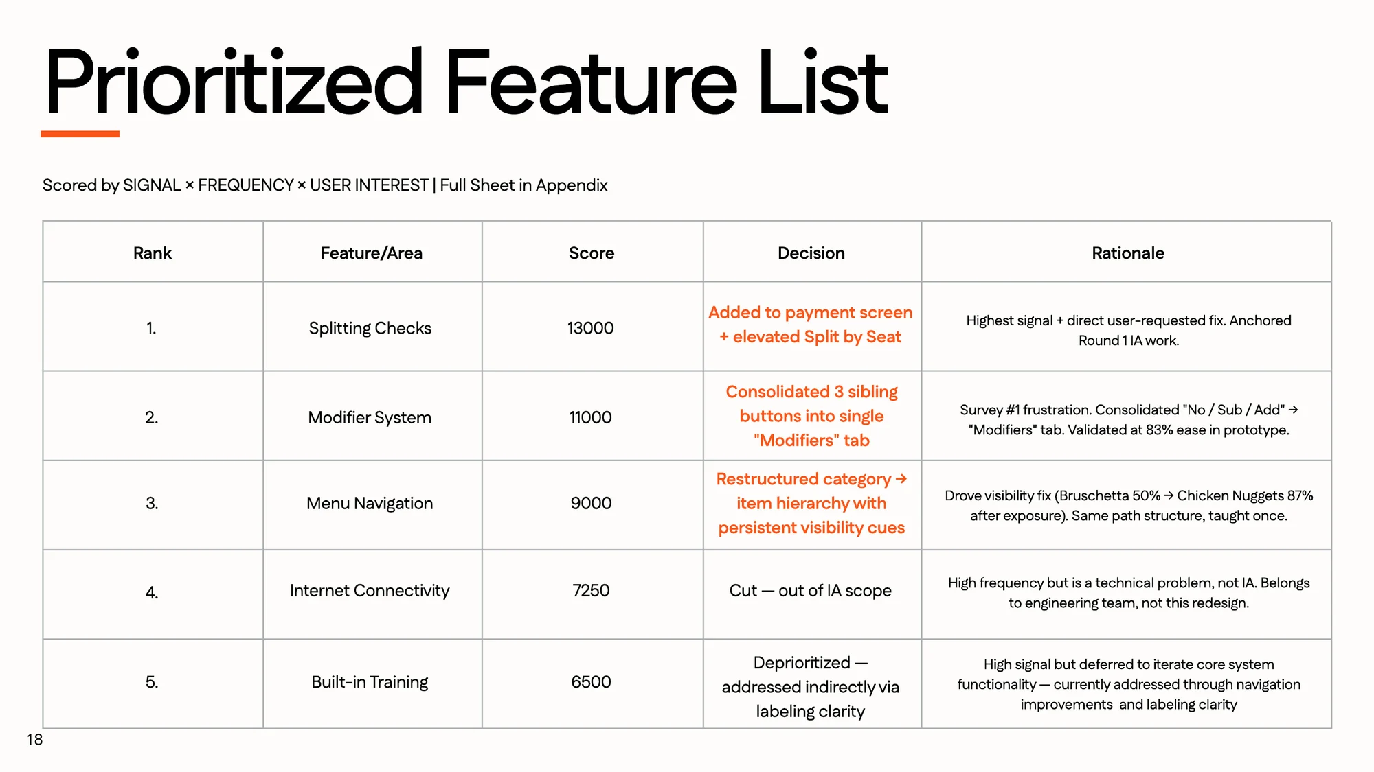
We didn't want to pick features by gut. Each candidate was scored on signal x frequency x user interest, using our survey and interview coding. We took on the top three and made a call on the other two.
- Splitting checksHighest signal, and a fix users asked for directly.13,000 · Addressed
- Modifier systemThe survey's top frustration. We merged No, Sub, and Add into one Modifiers tab.11,000 · Addressed
- Menu navigationRestructured the category to item hierarchy and added visibility cues.9,000 · Addressed
- Internet connectivityCut. High frequency, but it's an engineering problem, not an information architecture one.7,250 · Cut
- Built-in trainingDeprioritized. High signal, but we wanted the core system right first. Clearer labels help indirectly.6,500 · Deferred
Cutting things on purpose was part of the work. Three problems fixed well beat five fixed halfway!
Rebuilding the structure around servers
Our goal was simple: improve server efficiency and accessibility, and cut down on errors. We redrew the sitemaps with servers first, and three changes carried most of the weight.
"Seeing so many different buttons and so much text on one screen is overwhelming, especially in a high-intense environment like a restaurant."
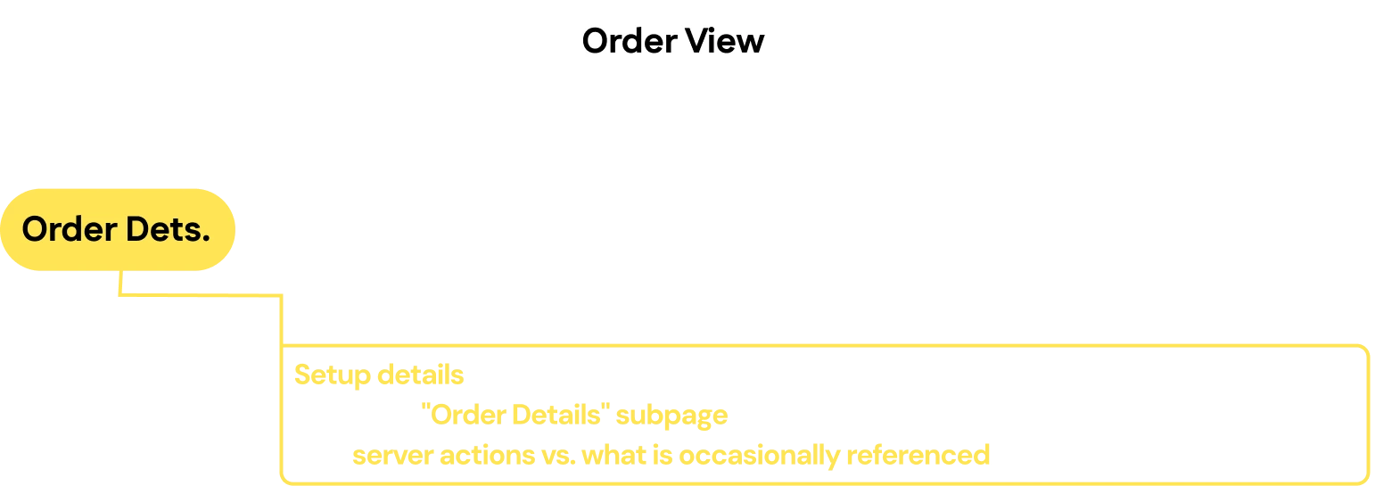
Setup details that don't change mid-shift (guest count, tab name, order type) moved one level down into an Order Details subpage. That's progressive disclosure: servers see what they act on right now, and the stuff they only check occasionally is one step away.

"Splitting a check is probably the most difficult thing to learn... it's kind of hard to navigate to where you do it. There's a little button that is split checks, but it's not labeled, so it's hard to find if you don't know where to look."
We promoted Split Check from local to global navigation. It went from buried in an overflow menu to a top-level action on the order and pay screens. Split Evenly and Split by Seat moved up the tree from grandchildren to direct children. The path dropped from 4 taps to 2 for one of the highest-frequency server tasks.
"I think it's pretty organized other than the modifications. So if they want to sub something, I have to click No, and then I have to go into general mods and add whatever it is."
We collapsed No, Sub, and Add into a single parent, which also gave us one place to make allergy capture faster and clearer (more on that below).
We picked tab names a new server could understand without training:
- Modifiers. Recognition over recall. It tells servers what's inside, while "No" tells them nothing without prior training.
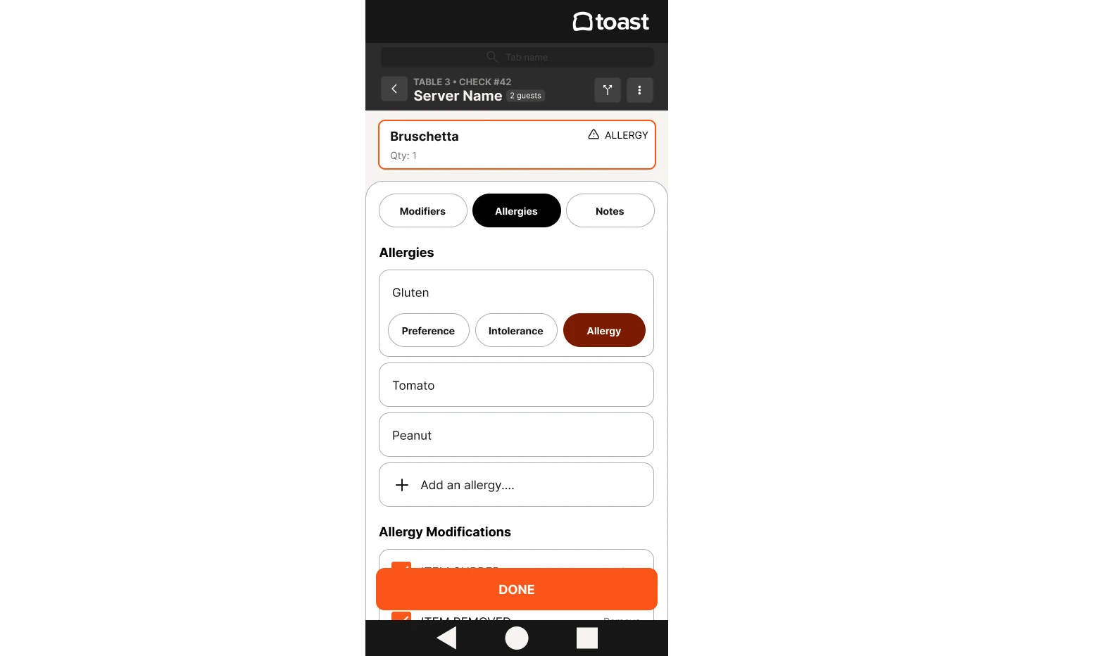
- Allergies. It gets its own tab so it reads as a primary task, not something buried under "general mods."
- Notes. Scannability under load. One word reads faster than "Special Requests" when you're parsing a tab row mid-shift.
One more call worth mentioning: interviewees had few complaints about Toast's existing labels, because the terms match restaurant jargon. So we didn't rename everything. We only added text labels where the handheld had icon-only buttons that the kiosk spells out.
Here is the whole structure, before and after. The original had a lot going on at every level, and the revision flattens the paths servers use most.
Making allergies hard to miss
Allergy information was one of the things we most wanted to get right. About 33 million Americans have a food allergy, and 53.9% of allergic reactions happen after the guest told the server about it. The information was shared, and it still got lost somewhere between the table and the kitchen.
Tree testing showed us a real gap: adding allergy information took 2+ extra clicks. So we built allergy capture right into the modifier flow, and added severity levels, so the kitchen knows the difference between "prefers no nuts" and "this guest could go to the hospital."
Testing the structure before drawing a screen
16 participants went through the tree, and the overall success rate was 79%. Our top three flows, each tested with a real scenario:
Speed held up too. For all three tasks, the middle half of participants finished in 10 to 18 seconds.
The least successful task was adding the Bruschetta (basically toast, which felt personal), with only 50% success (25% direct, 25% indirect, 50% fail). But once people had found that path once, 87% successfully added the chicken nuggets, which uses the same structure. That told us the structure was learnable and the real problem was visibility. So we kept the path and added cues to make it easier to spot the first time.
- Misclicks with modifiers became one combined Modifiers menu, to prevent accidental actions.
- Allergy info taking 2+ extra clicks became allergy capture built into the modifier flow.
From sketches to a tested prototype
We moved from sketches to wireframes to a first full iteration, then put it in front of restaurant staff using a realistic menu and modifier options.
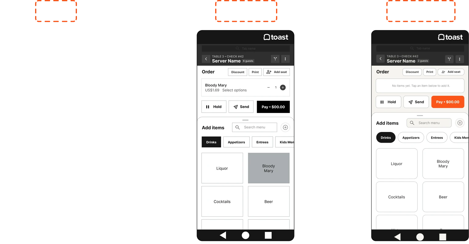
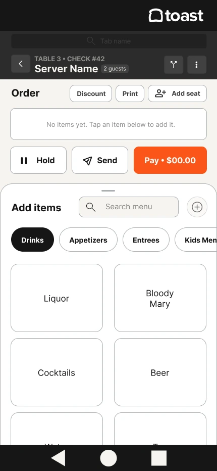
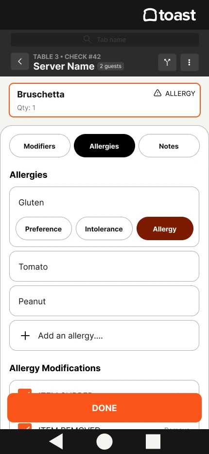
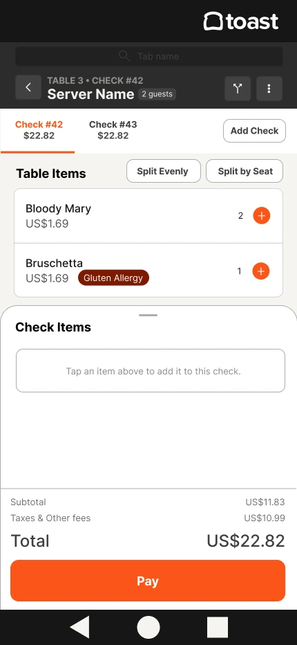
The first iteration: order view, allergy capture, and split check.
The allergy flow worked. Splitting a check did not, which lined up with everything we'd heard in research. Participants pointed to three things: where the split check button lived, the splitting interaction itself, and a prototype that didn't give them enough to tap on, which led to misclicks.
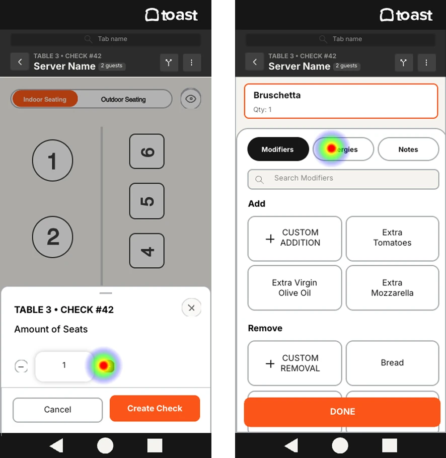
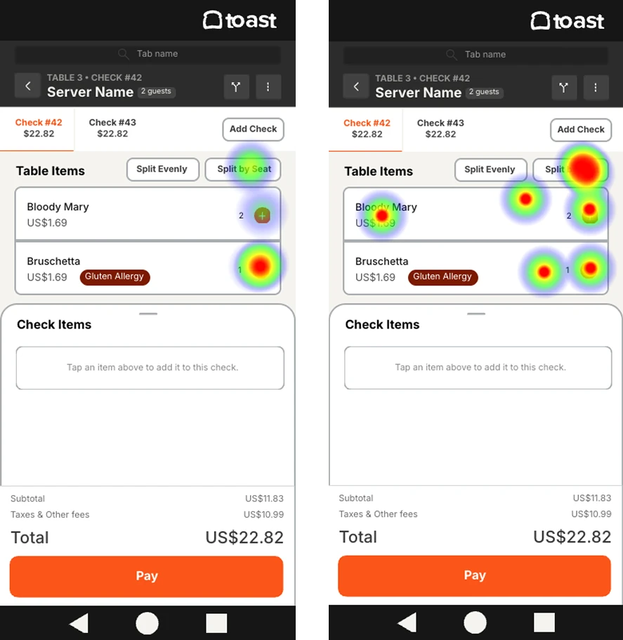
- Splitting checks didn't match mental models. We ran Crazy 8s to ideate new interactions, then redesigned and retested.
- You could only split on the payments screen. We elevated split checks from local to global navigation.
- Misclicks. We built out the prototype with many more touch points.
The biggest redesign was the split check screen. Before, checks were split into two columns and required moving items over one by one. The new layout is organized into zones, so you see everything at once and can quickly spot unassigned items. We kept to existing Toast table and order patterns, because the issue wasn't the zones. It was information density causing cognitive overload.
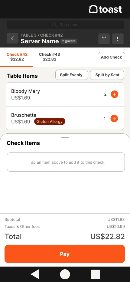
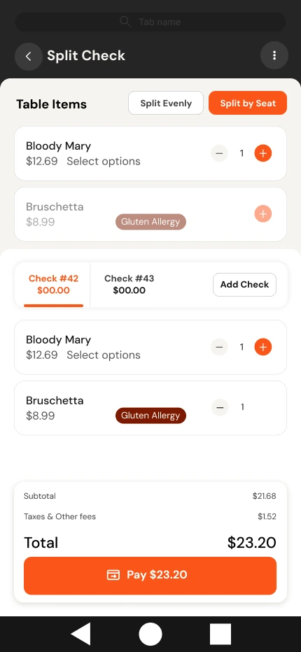
Split check success jumped from 66% to 86%, a 20 point gain from one round of iteration! The post-test responses backed it up:
- 72% found the split check button easy or somewhat easy to locate
- 72% found splitting the check easy or somewhat easy
- 86% said it was better than their current system, especially the split check flow
- 100% were satisfied or somewhat satisfied with the payment screen
- 100% were satisfied or somewhat satisfied with the tip selection screen
Giving Toast a system that holds its own
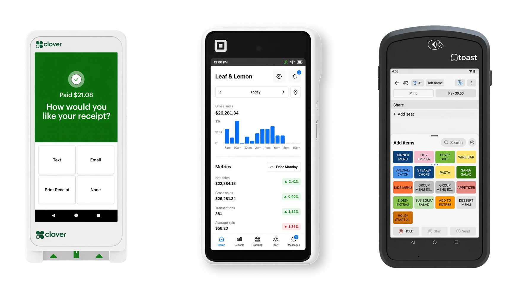
Competitors like Square and Clover have strong design systems, and it shows. Here are the handhelds we benchmarked.
We built four directions, each centered on one word: approachable, empowering, playful, essential. Then we let users vote.
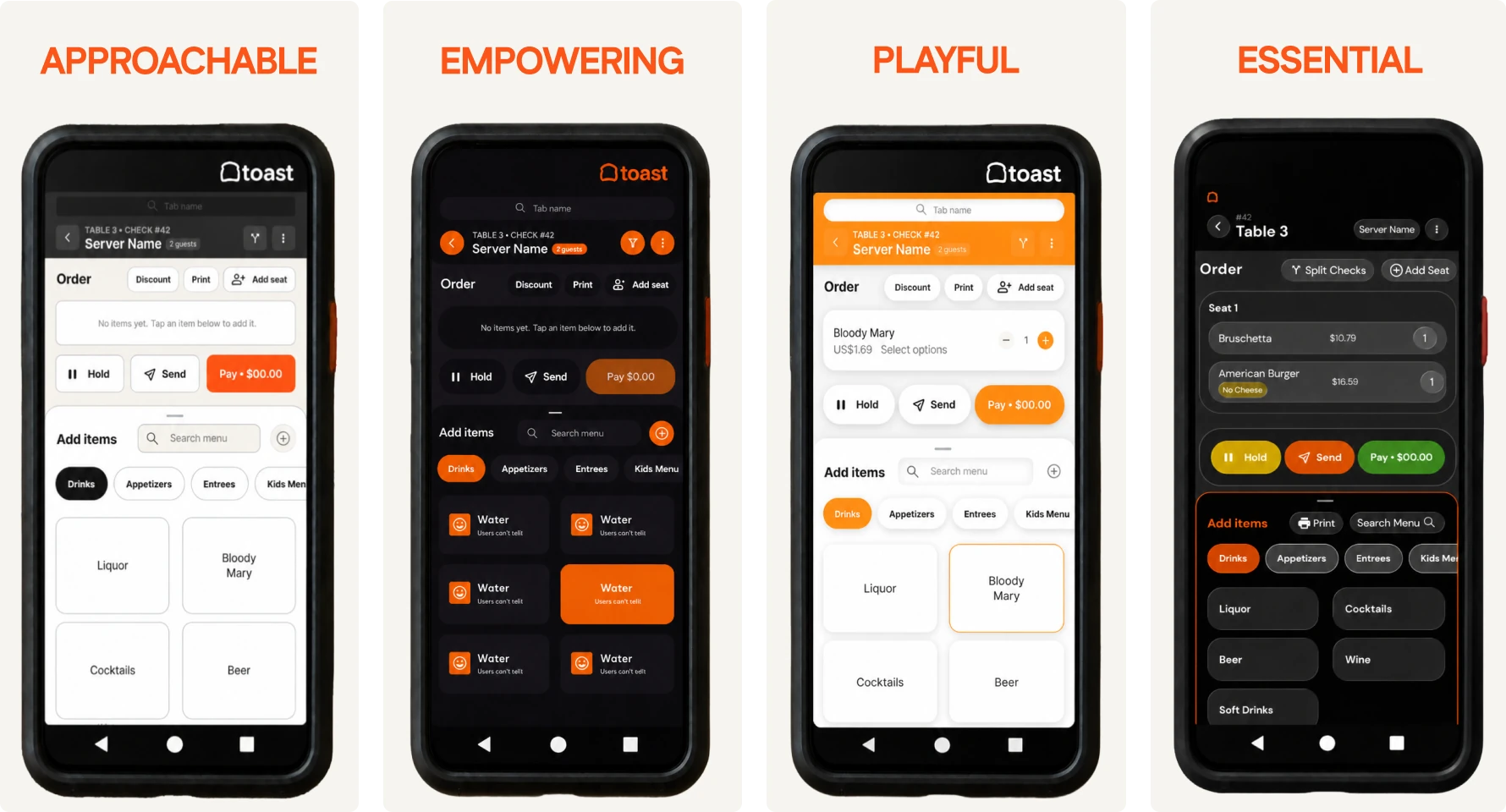
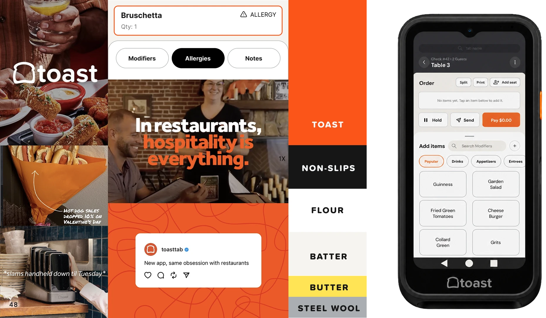
Approachable won with 36% of the vote. It leans into legibility, accessibility, and a professional tone, and we built it out into a full component system.
Where it landed
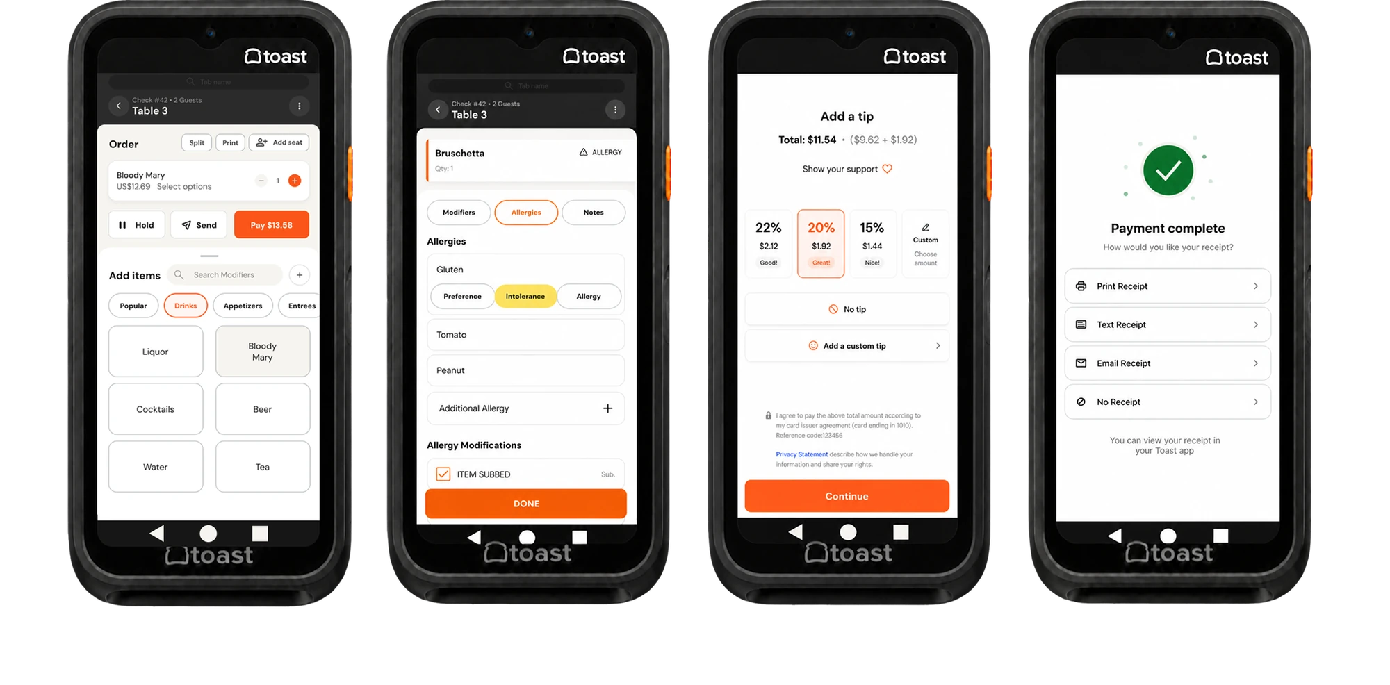
Servers can now take and manage table orders with fewer taps, fewer errors, and less manager rescue. We expect that to improve restaurant efficiency and table turnover. Better efficiency means a better perceived value for Toast, which should mean more restaurants staying, and more of them recommending it to others.
What I'd carry forward
We had 10 weeks, so we redesigned one flow (taking an order, modifying it, and splitting the check) instead of spreading ourselves across all of Toast, like butter scraped over too much bread. That meant leaving the manager side out. Managers showed up in our research and in our persona, and their pain points are real, but a focused flow we could test properly was worth more than a wider one we couldn't.