SoundCloud has something Spotify and Apple Music don't: a swipeable discovery feed full of new and emerging artists. The problem is that people who are new to the app never find it, and when they do find a song they love, sharing it with a friend is surprisingly hard.
With a few simple changes to the home screen, the feed, and sharing, SoundCloud can help listeners discover more music and share it more easily. After the redesign, every tester found the feed, every tester shared a song with a new friend right from the song, and no one rated their likelihood of switching from Spotify below a 5 out of 7.
Start broad, then watch real people
Each method set up the next one. We started with heuristic evaluations to decide where to dig, then tested the current app with people, then tested our redesign twice.
- 1. Heuristic evaluations (4). Each of us evaluated the current app against usability heuristics on our own, to find which parts of SoundCloud would benefit most from research, testing, and proposed changes.
- 2. Moderated testing (8 sessions). We watched people use the current app to uncover specific problems with its flows and features.
- 3. Unmoderated testing (8 sessions, 2 rounds). The first 4 participants tested our first prototype. We tweaked it based on what we saw, and the next 4 tested the revised version.
Every participant was a Spotify or Apple Music user, ages 18 to 30, with little to no SoundCloud experience. That was on purpose. We weren't trying to make SoundCloud nicer for people who already use it. We wanted to know if it could win over the people listening somewhere else.
The heuristic evaluations showed two areas where improvements could bring serious value to the app:
- Discovering musicFinding new songs and artists you haven't heard before.
- Sharing musicSending a song you love to a friend.
Why the feed, and why sharing
It looks and feels like a TikTok or Instagram feed, but it's missing the interactions people expect from one.
- Aesthetic and minimalist designContrast issues, unclear copy, small buttons, and confusing icons.Severity 3
- Consistency and standardsNo easy liking or clear interactions like other feed-style apps have.Severity 2
- User control and freedomNo way to influence what the feed shows you, so it doesn't feel different from any other discovery page.Severity 2
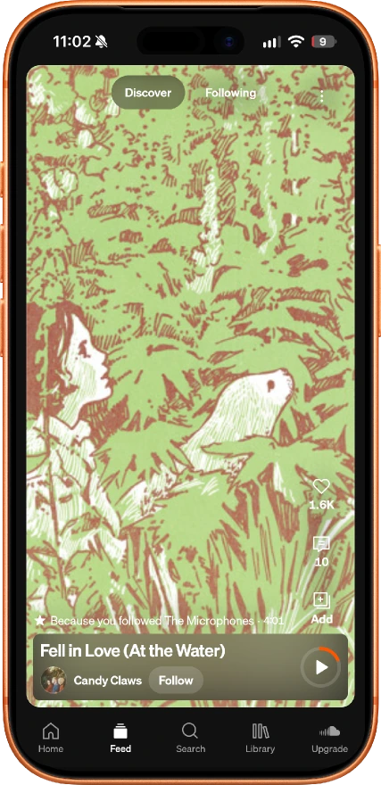
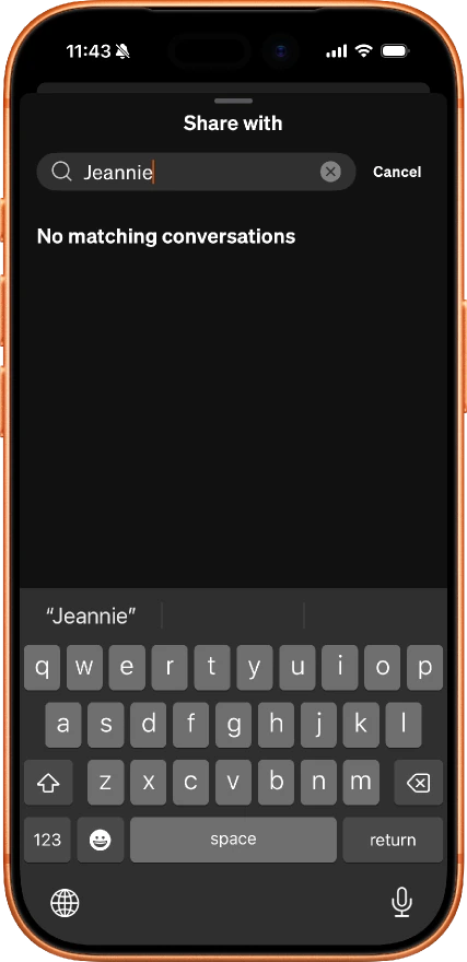
On most apps, you can search for anyone right from the share sheet. On SoundCloud, you can only share to people you already have a conversation with. Everyone else means leaving the song, finding Messages from the home page, and starting a new chat there.
- Consistency and standardsSharing doesn't work the way it does in other apps.Severity 2
- User control and freedomNo way to reach a new friend from where you are.Severity 2
- Flexibility and efficiency of useThe workaround is buried and takes extra steps.Severity 2
Watching people use the app as it is
Based on the heuristic evaluations, we framed 8 moderated sessions around three things: feed discoverability, music sharing, and opinions on the feed.
Not one participant found the feed naturally. SoundCloud was losing value because people weren't finding one of its strongest features. Once we showed it to them, they got it right away:
"I feel like it might be a better version of doing what you asked earlier, of like finding new things that you haven't heard before and being able to skip it fast." (P1)
Every participant tried to send the song to a new friend from the song's own page, which SoundCloud doesn't allow. Many got frustrated, took a long time to figure out a workaround, and some never managed to send it at all.
"Yeah I have no idea... so weird." (P4)
Three changes, aimed right at the problems
We didn't rebuild SoundCloud. We made the feed easy to find, gave people a reason to use it, and let them share the way they already expect to.
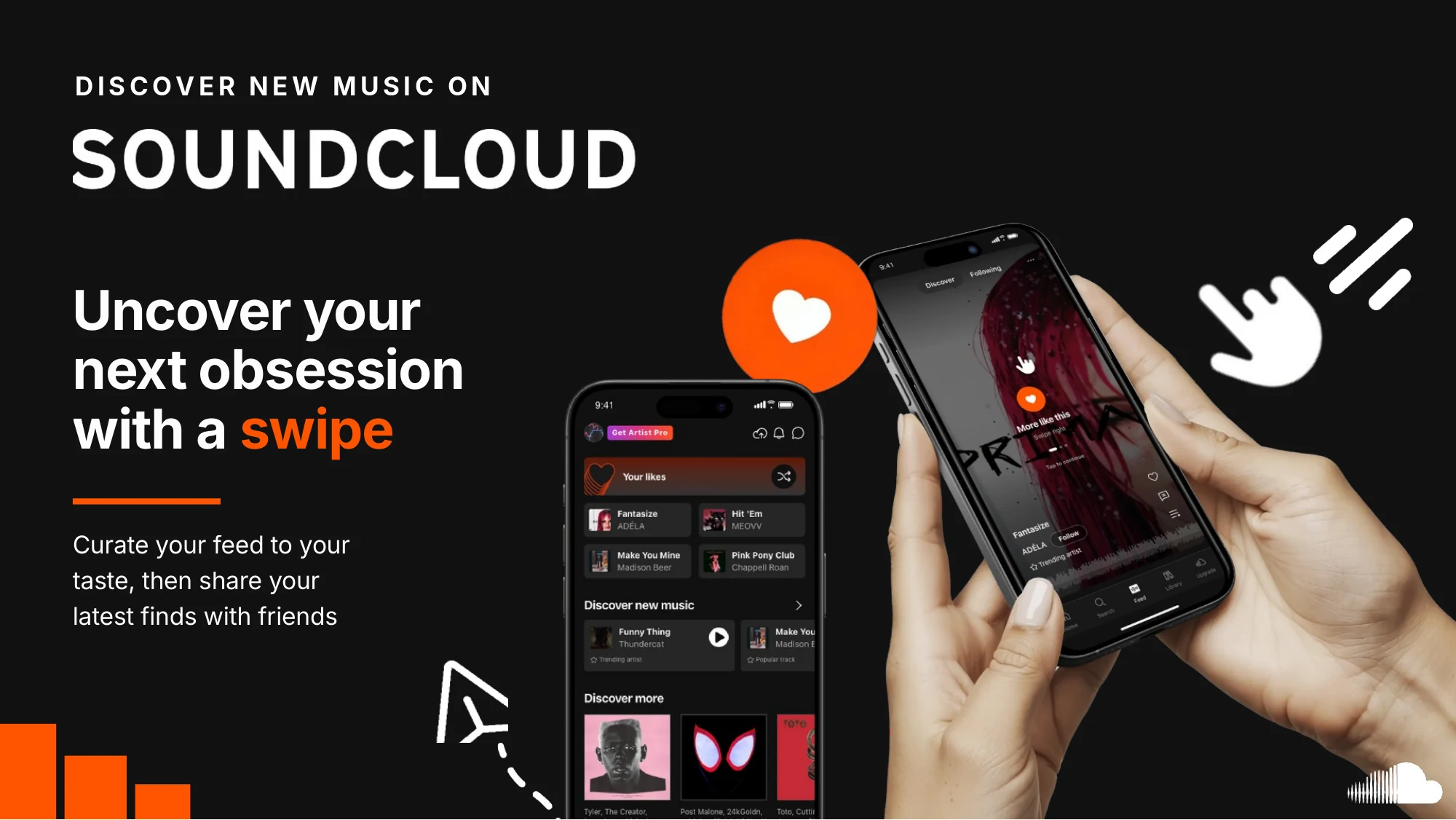
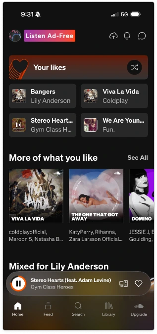
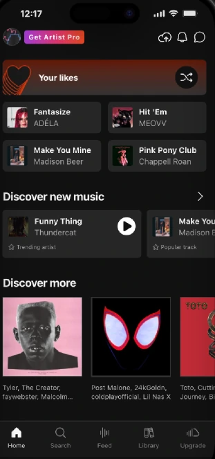
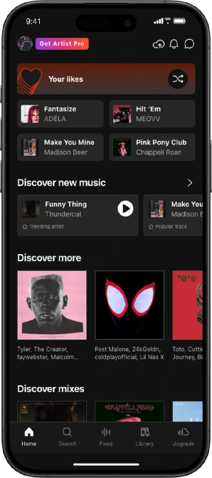
We added an access point to the feed built right into the home page content, so discovering new music is part of the first screen you see.
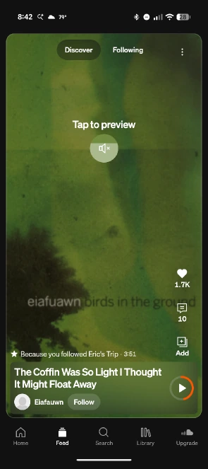
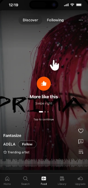
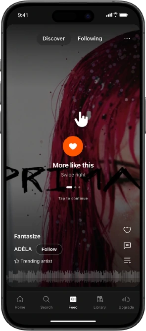
We added onboarding and swipe interactions so listeners can directly influence the music they're shown. Swipe right for more like this, swipe left to skip. The more you swipe, the better your recommendations get.
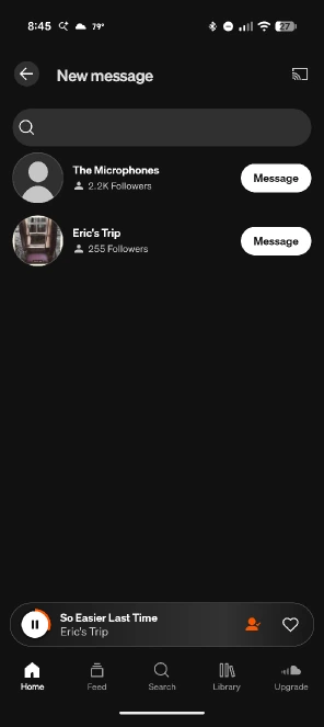
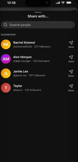
We made it possible to send a song to someone new straight from the song itself. Open the three-dot menu, search their username, and hit send.
Putting the prototype in front of new listeners
Our unmoderated sessions ran 7 to 11 minutes and covered feed usability, music discovery, and music sharing. We launched round 1 with 4 participants on our first prototype.
- 100% of participants went to the feed. That's a big deal, since none of our moderated participants found it before the redesign. One participant found it as soon as he noticed his liked songs were empty.
- 100% shared a song with a new friend. Every participant used the three-dot menu on the song, searched a username, and sent it. Smooth sailing.
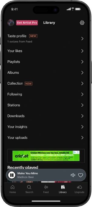
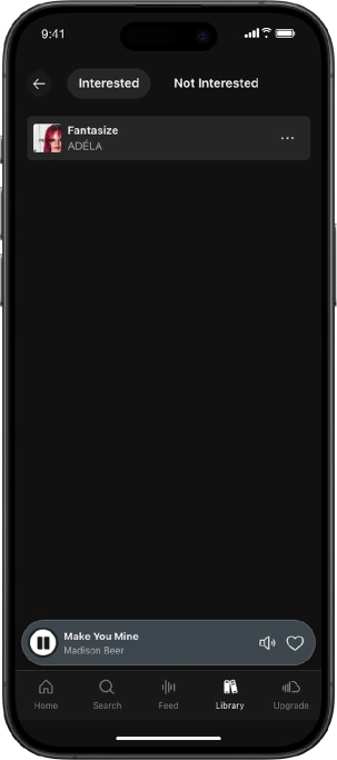
- Swiped songs were in the wrong place. Most users assumed the songs they swiped right on would be in their liked songs. They were actually saved to a separate "Taste Profile," which confused and frustrated people.
- Our task wording tripped people up. Two participants thought "mix" was its own feature when we asked them to add a song to a playlist. That one was on us, not the design, so we rewrote the task copy for round 2.
We gave users what they expected
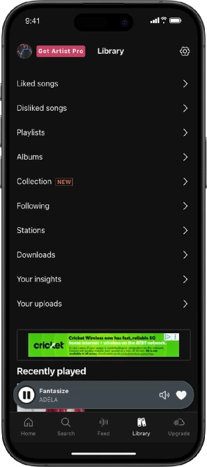
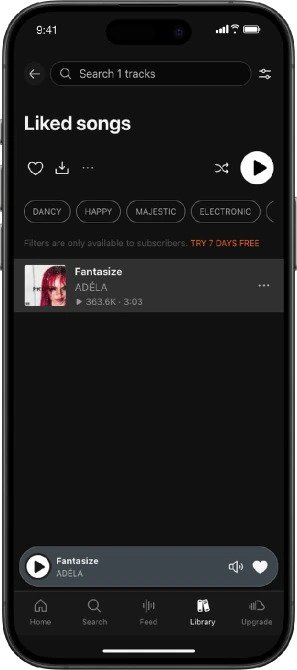
Instead of teaching people what a Taste Profile is, we dropped it. Songs you swipe right on now go into your Liked Songs, and songs you swipe left on go to a disliked list, both right in your Library.
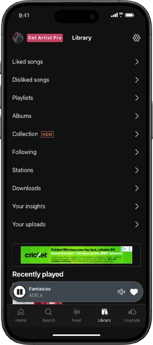
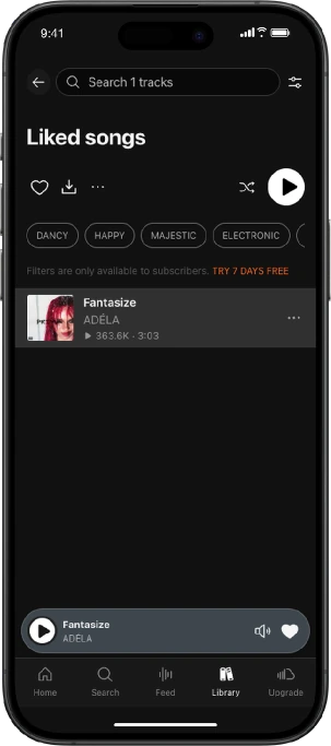
It worked. After the switch, round 2 participants found where their feed music was saved on their first try, and built playlists with it with very little friction.
The real test: is this enough to leave Spotify?
We knew the redesign got more people to the feed. But is the feed a real hook? At the end of each session we asked: "How likely are you to switch from Spotify to SoundCloud after today's session?"
On a scale of 1 to 7, where 7 is most likely to switch, no participant rated their likelihood of switching from Spotify to SoundCloud below a 5. Participants said they'd be tempted to switch after seeing the new features, which is a big result considering how strong a hold Spotify has on music listening.
Back to what made SoundCloud special
The final design leans into discovery, the thing SoundCloud has always done best. The home screen has a discovery section that takes you straight to the feed. From there, you swipe on songs and they land in your Liked Songs, right in your Library. Then you can turn them into a playlist and enjoy.
You can't love what you can't find
SoundCloud's feed is its biggest advantage over Spotify and Apple Music, but users can't benefit from a feature they never see. Better access and smoother usability put that advantage to work. Small changes, big impact.